2. Ketib and Qere.
3. Studying to Read from a Torah scroll.
4. Back to the "Original" Text(s).
5. Biblical texts, "Unclean Hands" and Religious Intolerance
6. Minding your dalets and reshes
7. Very High Quality Texts for Special Occasions
8. Additional Resources.
-
There are differences between manuscripts and also between editions which
are
based on the same manuscript. If you are obtaining/reading a text
for liturgical/scholarly reasons you should note the following:
-
A Tikkun is a printed book which is used to prepare Torah readers. Each each pair of pages---one with the cantillation/grammar and vowel symbols and the other with the pure consonantal text, in a font which resembles the scribal letters---corresponds to one sheet of a Torah scroll. A Tikkun, from whatever the source, will not necessarily agree with the text that you obtain by the methods described below.A Tikkun may not show the qere (see below). In chumashim the qere is usually printed at the bottom of the main text and in a font size which is even smaller than the already too small font size for the main text.
Even sources which use the Leningrad Codex as the basis for their text will differ. Aside from errors in transcribing, differences will occur because of the difficulty in reading the manuscript itself. For example the current Tanakh.us text is much more recent than the 1999 Jewish Publication Society Tanakh. For scholarly work the version number should be noted. This shown at the top of the start page of Tanakh.us in the format:
Unicode/XML Westminster Leningrad Codex [4.20]
You can see the difference between successive versions by going to the "Supplements" page.
Your starting point is the
tanakh.us web page.
[N.B. tanach.us and tanakh.us are equivalent terms and either may be used in connection
with
the web page.]
-
-
In order to ensure that the texts appear and print correctly it is suggested that one download and install
the Society of Biblical Hebrew "SBL Hbrw" font which is the default font for
tanakh.us.
You can download SBL Hebrew directly (click on "font download") . Note that the file that you download has the name [SBL_Hbrw.ttf], with an underbar between the words (ttf stands for "true type format" as opposed to otf which stands for "open type format". However the installed type will be listed as "SBL Hbrw" (without an underbar and this is the format used by tanakh.us. This font can also be used with word processors; the same page has keyboard layouts and installation instructions. Be sure to download the SBL Hebrew User Manual on the same page from which you may learn---as was my case---the intricacies of typesetting Biblical Hebrew (see in particular the discussion on page 14 on Psalm 27:13!)"SBL Hbrw" is a unicode based font which means that each letter, accent, etc. corresponds to a classification number established by the Unicode Consortium. You can read the discussion on the Tankh.us site and see the formal Unicode Consortium pages here Hebrew pages and here Hebrew presentation pages.
[WARNING: Do not use the SIL Hebrew font; the yod-heeriq combination (unicode element FB1D) is incorrect and the layout is not up to the very high "SBL Hbrw" standards].
-
In order to ensure that the texts appear and print correctly it is suggested that one download and install
the Society of Biblical Hebrew "SBL Hbrw" font which is the default font for
tanakh.us.
-
I will first show how to obtain a specific
portion of the Tanakh using the example of Exodus, chapter 16, verses 1 through 8. I will
abbreviate this below as: Exodus 16:1 - 8.
- Print / HTML copies: Once you have obtained the text that you want, go to the bottom right where you will see four rectangles. Choose the one that says "ODT" (open document format). You can now print to a PDF file and then produce a hard copy. If you prefer you can choose the HTML format.
-
Each book has an abbreviation and the list is obtained by
clicking on "syntax", just to the left of the empty box. At the bottom of the page are the
various
ways of choosing texts. Here are some examples with text of interest in
red and the command to enter in bold. The only restriction is
that you must stay within one book. You can turn off the numbers, on the layout menu
by clicking on "text only":
-
-- All of chapter 16 of
Exodus: ex 16.
There is no asterisk, just the chapter number.
-- Exodus, chapter 16, verses 1 through 8: ex 16:1 - 8. Note the colon after the chapter number and the dash to indicate the range (leaving space around the dash is optional)
-- Exodus, chapter 16, only verse 7: ex 16:7.
-- The Torah reading for Shabbat be-sha-lach which is Exodus, chapter 13, verse 17 through chapter 17, verse 16: ex 13:17 - 17:16.
For studying a text I prefer the default view, but with the font size changed to 32pt (as opposed to the default font size of 24 points) as in this example: Exodus 16:1 - 8; "full" at 32pt. At this size there is room for notes. Notice that on the top right "layout" is set to "full" and the the next item, content is set to "accents".
Note: there are 28.3 printer points to a centimetre, but font sizes are nominal and the actual size depends upon the design.
-
For singing and for difficult texts, I use a
font size
of 40 points and the verse
view as in this example:
Exodus 16:1 - 8, "full", verse view at 40pt.
- To obtain the verse view click on layout. Then click on the last item of the drop-down menu which is the toggle between regular and verse views.
Since the Haftarah is sung using a printed text, you can now start practicing.
-
The reason that I chose Exodus 16:1 - 8 is that in both verses 2 and 7 we have an example of
a ketib-qere pair. The ketib (what is
written
in the
text) appears in red above the line. The
qere is what appears in the a
margin of the manuscript, and
is to
be read instead of the ketib) is in
blue and on the line. The actual number of these pairs will vary with the manuscript, but the order of
magnitude is about 1300. In the "supplement" section Tanakh.us provides us with number of pairs in each book and by clicking on the name of the
book one can see alll the relevant verses.
- If you do not want to see the ketib, go to layout and on the drop-down menu click on "qere only".
The study of the ketib and qere is a very interesting one and often leads to new interpretations of the Biblical text. Contrary to what one often reads the ketib is not always incorrect and often is just as good (or even better) a reading than the qere. In some cases as in Genesis 30, verse 11 the qere is wrong whereas the ketib is correct.
-
-
The Tikkun that one uses to practice Torah reading
sometimes has the
qere in
brackets next to the ketib.
If you wish to see all the ketib-qere pairs, these can be found on the "Supplements" page. This page also contains other interesting features. For instance suppose you want to know how many times Moses's name appears in Joshua. To do this click on the "search" button. Next find a Hebrew text where "mo-sheh" appears and copy it to text box. Now choose Joshua as the book to search. All fifty-nine verses with "mo-sheh" will be listed. You may be surprised---as I was---to learn that "mo-sheh" appears fewer times (thirty-nine times) in Deuteronomy. Verse lengths? number of words? the number of verses in Genesis which are twelve words long. etc., you will find this and more!
-
The Tikkun that one uses to practice Torah reading
sometimes has the
qere in
brackets next to the ketib.
Start as above with suitable font size with the full version and with both the vowel-signs and the cantillation symbols. You may also want to choose the verse view (see above). I will illustrate using Exodus, chapter 16, verses 1 through 8 as above.
-
Next practice
without the cantillation symbols, but with
the vowel-signs.
- To do this, change "content" from "accents" to "vowels".
-
Next practice with only the consonants.
- To do this, change "content" to "consonants".
-
Next practice without the verse numbers
- To do this change "layout" to "text only".
-
Next you will want practice with a printed Torah font. You can
download it from here. The file that you
download is [Stam Ashkenaz CLM Medium.zip]. You will then unzip this file and install it (the method depends
on your operating system; see the instructions just below the font and license). The
file that you end up with is [Stam Ashkenaz CLM Medium.ttf]. However when you use this font in
Tanakh.us you will enter "Stam Ashkenaz CLM" under "font family" and then "change font". This is how
the text appears with a Torah font.
- The same site has a Sephardic version of a Torah font. [The site also has many other Hebrew fonts].
-
Next you will want practice with a Tikkun.
As stated above the text in a Tikkun may not agree
with the text that you obtain from Tanakh.us. The source of a Tikkun is usually not given so
"reader beware!". You have to check if the Ketib and Qere are indicated
- You can obtain portions of a Tikkun by following this link. Here is how the Tikkun for Exodus 16:1 - 8 appears. [This is provided by Adat Shalom Reconstructionist Congregation in Bethesda, Maryland.]
-
Now that you have mastered the printed text, you are certainly looking for a
new
challenge. Tanakh.us
has
just the thing for you:
-
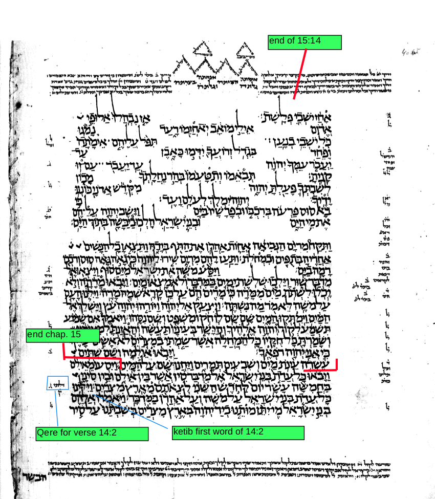
Go to the bottom left and you will see "LC
facsimile".
Click on "go" and
you will see the
page of the Leningrad Codex with your text.
On the upper left it indicates the book, chapter(s) and verses contained on the page.
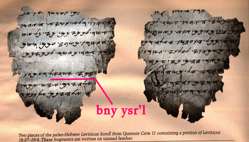
Before the Jews adopted the "square" style of letters of the type used today, probably sometime in the first century B.C.E, the Bibiical texts were written in what is usually referred to as "paleo-Hebrew". Here is an example of parts of Leviticus 17 and 19.
Here is the transcription of the text along with parts of the text of Leviticus 17 and 19 in "square" Hebrew characters, as well as in three ancients characters.
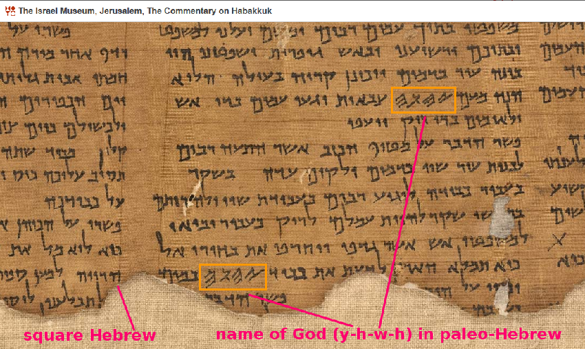
manuscript. Everything is written in "square" letters except for the one word of four letters which is written in paleo-Hebrew. This is the "tetragrammaton", the name of God. This manuscript would not have "rendered the hands unclean". The motives behind such statements is clear from the rabbinic commentaries.
Here is a chart from Early History of the Alphabet by J. Naveh, showing part of the development of the "paleo-Hebrew" alphabet.
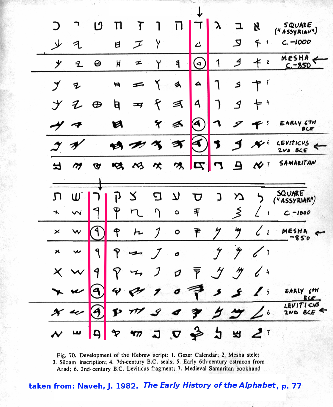
Here are some examples of Leviticus 17 and 19 set in three ancients character sets.
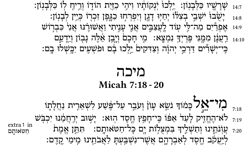
As I was to sing the Haftarah for Shabbat Shuvah (Adath Shalom Congregation, Ottawa, Canada), and because there are at least five traditions as to what should be sung, I decided to print up exactly what I would be chanting:
This was typeset using XeTeX, the Bidi bi-directional command and several macros, including Opmac for the marginal notes. The Hebrew was simply copied as is from Tanach.us and the English from Sefaria and then pasted in a text editor, without any further manipulation of the text itself.
From this site you can obtain the English Jewish Publication Society Tanakh. [To obtain, e.g. the text of Exodus 16, type "Exodus" in the search box in the upper left corner.] They also have a Hebrew text from Tanakh.us, but is not the current one and it does not show the ketib and qere. You should use the latest Tanakh.us text as above.
Sefaria also has the Babylonian Talmud with interlineal Aramaic and English (Steinsaltz translation) and links to commentaries and quotations from the the Tanakh. They have many, many other texts, a wonderful project!
Le site lexilogos.com a des liens à beaucoup de traductions en Français y inclus la Traduction du rabbinat de 1902
