import pandas as pd
import seaborn as sb
import requests
import openpyxl
import matplotlib.pyplot as pltOntario Research Fund - Research Excellence Program - Open Ontario
Pairs Plot
Open Ontario
Software:Python
Software:R
zipfiles
xlsx files
CKAN API
Data Provider
The provincial government of Ontaio provides open access to thousands of data sets via their Open Data Ontario portal. The purpose of sharing all data documents with the public is to remain transparent and accessible. More details about the data license, training materials, and other information can be found here.
Ontario Research Funding
This data set provides a summary of research projects funded by the Ministry of Colleges and Universities. The data format changes in 2018-2019, so the dataset is split into current and historical versions. We will extract both of them, since they differ in format and API details.
The Ontario Research Fund current dataset includes research projects funded through the Research Excellence Program from 2018 to 2026. The Ontario Research Fund historical dataset covers 2004 - 2018. These dataset can be found online as an xlsx file so you could use a web browser to visit the page, find the appropriate dataset(s), download, and then load it into R / Python directly. However, for reproducibility and to facilitate reporting updates when new data is released, the full process is automated using the API.
Goal
We search for the datasets using the CKAN API. From there we filter down to the English versions and download the datasets. Data is in different formats, so we need to extract the appropriate sheet from the xlsx files and merge them to extend the dataset. Some scatter plots are made.
Libraries
library(jsonlite)   # handling the json returns from API calls
library(tidyverse)  # data manipulation
library(lubridate)  # dates
library(viridis)    # colours
library(hrbrthemes) # plot options
library(ggridges)   # plot options
library(readxl)     # loading excel files
Using the API to Find the DataStore Resource Id
The Ontario Data Catalogue uses the CKAN API. The CKAN API uses some specific terminology, a CKAN package is a dataset landing page, while a resource is an individual file, table, API-backed data object, or supporting document attached to that dataset.
The CKAN API is similar ot a REST API in that we interface it using a constructed URL and obtain a response. We will use it to search for a dataset and obtain the url to download a data file.
We use the API to search for the research funding dataset and identify the file url. Here we’ll search for ontario-research-funding and see if we can find the data table identifier. Search is performed by adding search terms to the api_base to construct a url. We include a timeout in the request to avoid waiting forever if our internet (or the API) breaks. The API returns a json file search_results with up to 10 rows (user defined value that works here because there aren’t many bear datasets) that needs reshaping to make it easier to read the important values.
We already know our target dataset is https://data.ontario.ca/en/dataset/ontario-research-funding-summary-current, so the package name is ontario-research-funding-summary-current. But to showcase the process, we will start by searching available resources to find the dataset name. If we knew the package name (from navigating in a browser) we could query the API via package_show?id=<exact resource name here>. Here we assume that we don’t know the name and need to search for it using the API to query via package_search?q=<keywords go here>.
api_base = "https://data.ontario.ca/en/api/3/action"
research_search_terms = "ontario-research-funding"

research_search_response = requests.get(
    f"{api_base}/package_search",
    params={
        "q": research_search_terms,
        "rows": 200
    },
    timeout=30
)
research_search_response.raise_for_status()

research_search_results = research_search_response.json()["result"]["results"]

research_datasets = pd.DataFrame([
    {
        "name": dataset["name"],
        "title": dataset["title"],
        "resources": dataset["num_resources"],
        "modified": dataset["metadata_modified"]
    }
    for dataset in research_search_results
])

research_matches = research_datasets[
    research_datasets["name"].str.contains(
        "ontario-research-funding",
        regex=False
    )
]

research_matches
name ... modified
106 ontario-research-funding-summary-current ... 2026-03-09T15:26:49.565152
111 ontario-research-funding-summary-historical ... 2025-04-30T16:00:44.772212
[2 rows x 4 columns]api_base = "https://data.ontario.ca/en/api/3/action"
research_search_terms <- "ontario-research-funding"
research_search_url <- paste0(
api_base,
"/package_search?q=", URLencode(research_search_terms, reserved = TRUE),
"&rows=200"
)
research_search_results <- fromJSON(
research_search_url,
simplifyDataFrame = TRUE
)$result$results
research_search_results|> glimpse()Rows: 200
Columns: 45
$ access_instructions <df[,2]> <data.frame[26 x 2]>
$ access_level <chr> "under_review", "under_review", "ope…
$ asset_type <chr> "dataset", "dataset", "dataset", "datas…
$ creator_user_id <chr> "faba29e3-f7ad-4b37-ad77-3ce832d12630",…
$ current_as_of <chr> "2016-09-16", "2018-08-07", "2018-11-19…
$ exemption <chr> "none", "none", "none", "legal_and_cont…
$ exemption_rationale <df[,2]> <data.frame[26 x 2]>
$ geographic_coverage_translated <df[,2]> <data.frame[26 x 2]>
$ id <chr> "71a16f2f-8cb1-457a-b610-836a6c048bee",…
$ isopen <lgl> FALSE, FALSE, FALSE, FALSE, FALSE, F…
$ keywords <df[,2]> <data.frame[26 x 2]>
$ license_id <chr> "notspecified", "notspecified", "OGL…
$ license_title <chr> "Licence Not Specified", "Licence Not S…
$ maintainer <lgl> NA, NA, NA, NA, NA, NA, NA, NA, NA, NA,…
$ maintainer_branch <df[,2]> <data.frame[26 x 2]>
$ maintainer_translated <df[,2]> <data.frame[26 x 2]>
$ metadata_created <chr> "2020-01-11T05:18:48.686824", "2020-…
$ metadata_modified <chr> "2021-01-14T13:30:22.755788", "2021-01-…
$ name <chr> "ontario-libraries-capacity-fund-resear…
$ node_id <chr> "76666", "105743", "109936", "105201", …
$ notes <chr> "This dataset includes basic organiz…
$ notes_translated <df[,2]> <data.frame[26 x 2]>
$ num_resources <int> 0, 0, 5, 0, 0, 0, 0, 0, 0, 4, 3, 0, …
$ num_tags <int> 6, 4, 4, 4, 6, 6, 4, 4, 4, 4, 4, 6, 4, …
$ opened_date <chr> "2016-09-16", "2018-08-07", "2018-12-18…
$ organization <df[,10]> <data.frame[26 x 10]>
$ owner_org <chr> "00d8527a-e405-4cd6-a388-93710db8c619",…
$ private <lgl> FALSE, FALSE, FALSE, FALSE, FALSE, FALS…
$ state <chr> "active", "active", "active", "active",…
$ title <chr> "Ontario Libraries Capacity Fund - R…
$ title_translated <df[,2]> <data.frame[26 x 2]>
$ type <chr> "dataset", "dataset", "dataset", "datas…
$ update_frequency <chr> "periodically", "as_required", "yearly"…
$ version <lgl> NA, NA, NA, NA, NA, NA, NA, NA, NA, NA,…
$ tags <list> [<data.frame[6 x 5]>], [<data.frame…
$ resources <list> [<data.frame[0 x 0]>], [<data.frame[0 x…
$ groups <list> [], [], [], [], [], [], [], [], [], [],…
$ relationships_as_subject <list> [], [], [], [], [], [], [], [], [], [],…
$ relationships_as_object <list> [], [], [], [], [], [], [], [], [], [],…
$ license_url <chr> NA, NA, "https://www.ontario.ca/page…
$ author <chr> NA, NA, NA, NA, NA, "", NA, NA, NA, "",…
$ author_email <chr> NA, NA, NA, NA, NA, "", NA, NA, NA, "",…
$ geographic_granularity <chr> NA, NA, NA, NA, NA, "", NA, NA, NA, "",…
$ maintainer_email <chr> NA, NA, NA, NA, NA, "ndmminister@ontar…
$ url <chr> NA, NA, NA, NA, NA, "", NA, NA, NA, ""…research_datasets <- research_search_results |>
transmute(
name,
title,
resources = num_resources,
modified = metadata_modified
)
research_matches <- research_datasets |>
filter(str_detect(name, fixed("ontario-research-funding")))
research_matches name
1 ontario-research-funding-summary-current
2 ontario-research-funding-summary-historical
title resources
1 Ontario Research Funding – Summary (Current) 2
2 Ontario Research Funding – Summary (Historical) 2
modified
1 2026-03-09T15:26:49.565152
2 2025-04-30T16:00:44.772212We’ve managed to find the two different datasets; current and historical. We will start by selecting the current using a regular expression match, and pass the data package name into another API call in the field package_show. Note that resources = 2, which after filtering to current below, we will see shortly relates to English and French versions of the dataset. Later we will come back to this step and extract the historical dataset through a related but somewhat different procedure.
Current dataset (obtain and extract the xlsx file)
research_package_name = research_matches[
    research_matches["name"].str.contains("current", regex=False)
].iloc[0]["name"]

research_response = requests.get(
    f"{api_base}/package_show",
    params={"id": research_package_name},
    timeout=30
)
research_response.raise_for_status()

research_package = research_response.json()["result"]
research_resources = pd.DataFrame(research_package["resources"])

research_resource_summary = research_resources[
    [
        "id",
        "name",
        "format",
        "language",
        "datastore_active",
        "data_last_updated",
        "url"
    ]
]

research_resource_summary
id ... url
0 ebf11cfd-37f7-4775-b2d7-de4f1343787a ... https://data.ontario.ca/dataset/c2621390-9362-...
1 b071794f-61a4-42a2-b4b5-8242d48a059d ... https://data.ontario.ca/dataset/c2621390-9362-...
[2 rows x 7 columns]research_package_name <- research_matches |>
filter(str_detect(name, fixed("current"))) |>
slice(1) |>
pull(name)
research_package_url <- paste0(
api_base,
"/package_show?id=", URLencode(research_package_name, reserved = TRUE)
)
research_package <- fromJSON(research_package_url, simplifyDataFrame = TRUE)$result
research_resources <- as_tibble(research_package$resources)
research_resource_summary <- research_resources |>
select(
id,
name,
format,
language,
datastore_active,
data_last_updated,
url
)
research_resource_summary# A tibble: 2 × 7
id name format language datastore_active data_last_updated url
<chr> <chr> <chr> <chr> <lgl> <chr> <chr>
1 ebf11cfd-37f7-… Onta… XLSX english FALSE 2026-03-09 http…
2 b071794f-61a4-… Onta… XLSX french FALSE 2026-03-09 http…The research funding package has resources, but they are Excel files and datastore_active is FALSE. That means the datastore_search code used for the bear hunting data is not the right next step. In this case, the CKAN API is used to find the current download URL.
Excel files are like complicated lists of csv files. A typical workflow will always involves familiarizing yourself with the datafiles. In this example we will assume that we will recognize the sheet name. I know from exploring the dataset elsewhere that the sheet name changes as the data updates, so we will do some exploring to find the sheet names before settling into making a dataframe of the relevant sheet. There are a lot of bonus options when reading in from Excel (or a general csv file), such as the number of rows to skip, loading a subset of columns…, so keep that in mind for more complex analysis.
Note, there is a minor difference between how R and python obtain and load the Excel file. Python will download and open the Excel file directly from the url, whereas in R we need to download the file into a temporary location and load it from there.
# filter down to English
# also note that I'm being lazy and extracting the first row of a 1 row data frame
# and that this is hard coded with iloc[0].  That may not be good for your needs.
research_download_url = research_resources[
    (research_resources["language"] == "english") &
    (research_resources["format"] == "XLSX")
].iloc[0]["url"]

# the url:
research_download_url'https://data.ontario.ca/dataset/c2621390-9362-43ae-b10a-a3258ba800cd/resource/ebf11cfd-37f7-4775-b2d7-de4f1343787a/download/research_funding_summary_current_2018-2026_updated_en.xlsx'# list the sheet names:
with pd.ExcelFile(research_download_url) as xls:
print(xls.sheet_names)['Legend', 'July 2018-Jan 31 2026']# load only the sheet name that we recognize.
# Seeing our sheet_name = 'July 2018-Jan 31 2026', we could use that name explicitly,
# but since the sheet name will update when new data comes out we just hope that the
# format doesn't change and ask for the sheet in position 1
research_data_current = pd.read_excel(research_download_url, sheet_name = 1)
research_data_current.head() Program ... Keywords
0 Ontario Research Fund - Research Excellence ... functional genetics, cancer therapeutics
1 Ontario Research Fund - Research Excellence ... microbiome
2 Ontario Research Fund - Research Excellence ... diagnostics, rare diseases, cancer
3 Ontario Research Fund - Research Excellence ... protein interactome, drug-screening, cancer-re...
4 Ontario Research Fund - Research Excellence ... prenatal genetic test
[5 rows x 27 columns]research_download_url <- research_resources |>
filter(language == "english", format == "XLSX") |>
slice(1) |>
pull(url)
# the url:
research_download_url[1] "https://data.ontario.ca/dataset/c2621390-9362-43ae-b10a-a3258ba800cd/resource/ebf11cfd-37f7-4775-b2d7-de4f1343787a/download/research_funding_summary_current_2018-2026_updated_en.xlsx"# To load the file in R, you need to download it first, then open it using read_excel
dest_file <- tempfile(fileext = ".xlsx")
download.file(research_download_url, destfile = dest_file, mode = "wb")
# now we can explore the Excel file.
# list the sheet names:
excel_sheets(dest_file)[1] "Legend" "July 2018-Jan 31 2026"# load only the sheet name that we recognize.
# Seeing our sheet_name = 'July 2018-Jan 31 2026', we could use that name explicitly,
# but since the sheet name will update when new data comes out we just hope that the
# format doesn't change and ask for the sheet in position 2
research_data_current <- readxl::read_excel(dest_file, sheet = 2)
research_data_current |> head()# A tibble: 6 × 27
Program Round `Project Number` `Project Title` `Project Description`
<chr> <chr> <chr> <chr> <chr>
1 Ontario Research… Disr… 14401 AbSyn Technolo… AbSyn is a unique, O…
2 Ontario Research… Disr… 14405 RapidAIM: A te… Develop the first fu…
3 Ontario Research… Disr… 14407 Beyond the Gen… We will create a RNA…
4 Ontario Research… Disr… 14408 Interactome ma… We will develop a hi…
5 Ontario Research… Disr… 14409 Development of… We are developing a …
6 Ontario Research… Bioi… 15115 Global Scale M… Genomics technologie…
# ℹ 22 more variables: `Field of Research (FOR) - Level 1 Division Code` <chr>,
# `FOR - Level 1 Division Title` <chr>, `FOR - Level 2 Group Code` <chr>,
# `FOR - Level 2 Group Title` <chr>, `FOR - Level 3 Class Code` <chr>,
# `FOR - Level 3 Class Title` <chr>, `FOR - Level 4 Sub-Class Code` <chr>,
# `FOR - Level 4 Sub-Class Title` <chr>, `Lead Research Institution` <chr>,
# `Institution Type` <chr>, City <chr>, `Approval Date` <dttm>,
# `Fiscal Year` <chr>, `Ontario Commitment` <dbl>, …Historical dataset
We already have the search information from earlier, now we repeat the process changing current to historical to obtain the second datafile.
research_package_name = research_matches[
    research_matches["name"].str.contains("historical", regex=False)
].iloc[0]["name"]

research_response = requests.get(
    f"{api_base}/package_show",
    params={"id": research_package_name},
    timeout=30
)
research_response.raise_for_status()

research_package = research_response.json()["result"]
research_resources = pd.DataFrame(research_package["resources"])

research_resource_summary = research_resources[
    [
        "id",
        "name",
        "format",
        "language",
        "datastore_active",
        "data_last_updated",
        "url"
    ]
]

research_resource_summary
id ... url
0 bda9aebe-399f-4360-9abe-5d88d6b2b10c ... https://data.ontario.ca/dataset/d8391c91-723f-...
1 83bd55ed-d259-4165-b16b-014eefdb1131 ... https://data.ontario.ca/dataset/d8391c91-723f-...
[2 rows x 7 columns]research_package_name <- research_matches |>
filter(str_detect(name, fixed("historical"))) |>
slice(1) |>
pull(name)
research_package_url <- paste0(
api_base,
"/package_show?id=", URLencode(research_package_name, reserved = TRUE)
)
research_package <- fromJSON(research_package_url, simplifyDataFrame = TRUE)$result
research_resources <- as_tibble(research_package$resources)
research_resource_summary <- research_resources |>
select(
id,
name,
format,
language,
datastore_active,
data_last_updated,
url
)
research_resource_summary# A tibble: 2 × 7
id name format language datastore_active data_last_updated url
<chr> <chr> <chr> <chr> <lgl> <chr> <chr>
1 bda9aebe-399f-… Onta… XLSX english FALSE 2024-11-18 http…
2 83bd55ed-d259-… Onta… XLSX french FALSE 2024-11-18 http…As before, the research funding package has resources, but they are Excel files and datastore_active is FALSE. We use the CKAN API to find the download URL.
# filter down to English
# also note that I'm being lazy and extracting the first row of a 1 row data frame
# and that this is hard coded with iloc[0].  That may not be good for your needs.
research_download_url = research_resources[
    (research_resources["language"] == "english") &
    (research_resources["format"] == "XLSX")
].iloc[0]["url"]

# the url:
research_download_url'https://data.ontario.ca/dataset/d8391c91-723f-4f10-ae31-61c6676a37fa/resource/bda9aebe-399f-4360-9abe-5d88d6b2b10c/download/research_funding_summary_historical_2004-2018_en.xlsx'# list the sheet names:
with pd.ExcelFile(research_download_url) as xls:
print(xls.sheet_names)['Legend', 'Oct 2004-June 2018']# load only the sheet name that we recognize.
# Seeing our sheet_name = 'Oct 2004-June 2018',
# since the sheet name will probably not update since the data is historical,
# we hard code the name
research_data_historical = pd.read_excel(research_download_url, sheet_name = 'Oct 2004-June 2018')
research_data_historical.head() Program ... Keywords
0 ISOP ... NaN
1 Ontario Research Fund - Research Infrastructure ... NaN
2 Ontario Research Fund - Research Infrastructure ... cognitive modelling, simulation, visualization...
3 Ontario Research Fund - Research Infrastructure ... autism spectrum disorders, genetics, subgroupi...
4 Ontario Research Fund - Research Infrastructure ... High-Performance Computing, Applied Parallel C...
[5 rows x 27 columns]research_download_url <- research_resources |>
filter(language == "english", format == "XLSX") |>
slice(1) |>
pull(url)
# the url:
research_download_url[1] "https://data.ontario.ca/dataset/d8391c91-723f-4f10-ae31-61c6676a37fa/resource/bda9aebe-399f-4360-9abe-5d88d6b2b10c/download/research_funding_summary_historical_2004-2018_en.xlsx"# To load the file in R, you need to download it first, then open it using read_excel
dest_file <- tempfile(fileext = ".xlsx")
download.file(research_download_url, destfile = dest_file, mode = "wb")
# now we can explore the Excel file.
# list the sheet names:
excel_sheets(dest_file)[1] "Legend" "Oct 2004-June 2018"# load only the sheet name that we recognize.
# Seeing our sheet_name = 'Oct 2004-June 2018',
# since the sheet name will probably not update since the data is historical,
# we hard code the name
research_data_historical <- readxl::read_excel(dest_file, sheet = 'Oct 2004-June 2018')
research_data_historical |> head()# A tibble: 6 × 27
Program Round `Project Number` `Project Title` `Project Description`
<chr> <chr> <chr> <chr> <chr>
1 ISOP ISOP… IS05-01-001 International … The IRC represents a…
2 Ontario Research… Larg… 8224 Montreal Diabe… Diabetes is a chroni…
3 Ontario Research… Larg… 8883 Carleton Unive… The infrastructure e…
4 Ontario Research… Larg… 7939 Mobile Laborat… The project will est…
5 Ontario Research… Larg… 7905 A Secure Mulit… Provision of state-o…
6 Ontario Research… Larg… 7499.1 SHARCNET 2 - E… The Shared Hierarchi…
# ℹ 22 more variables: `Field of Research (FOR) - Level 1 Division Code` <dbl>,
# `FOR - Level 1 Division Title` <chr>, `FOR - Level 2 Group Code` <chr>,
# `FOR - Level 2Group Title` <chr>, `FOR - Level 3 Class Code` <dbl>,
# `FOR - Level 3 Class Title` <chr>, `FOR - Level 4 Sub-Class Code` <dbl>,
# `FOR - Level 4 Sub-Class Title` <chr>, `Lead Research Institution` <chr>,
# `Institution Type` <chr>, City <chr>, `Approval Date` <dttm>,
# `Fiscal Year` <chr>, `Ontario Commitment` <dbl>, …Tips based on status of datastore_active
- If a resource has
datastore_active == TRUE, use itsidwithdatastore_search. - If
datastore_active == FALSE, use the resourceurldirectly to download the file. Load the datafile appropriately for itsformat, typically from Open Ontario we are interested in CSV, XLSX, GeoJSON, or ZIP. - If a package has several resources, filter by
language,format,name, etc…
Data Merging
Merging is easiest if the datasets have the same columns, since then they can just be stacked. Let’s look at this column names that match and also those that appear in only one.
# Columns common to both DataFrames
print(list(
    set(research_data_historical.columns)
    .intersection(research_data_current.columns)
))
['Program', 'Project Description', 'Field of Research (FOR) - Level 1 Division Code', 'FOR - Level 3 Class Code', 'Lead Research Institution', 'Round', 'Last Name', 'Expenditure Type', 'Ontario Commitment', 'Total Project Costs', 'Project Number', 'FOR - Level 2 Group Code', 'FOR - Level 4 Sub-Class Title', 'First Name', 'Language', 'Approval Date', 'FOR - Level 1 Division Title', 'Keywords', 'Fiscal Year', 'FOR - Level 4 Sub-Class Code', 'Middle Name', 'Project Title', 'Salutation', 'City', 'FOR - Level 3 Class Title', 'Institution Type']# Columns in current but not historical
print(list(
set(research_data_current.columns)
.difference(research_data_historical.columns)
))['FOR - Level 2 Group Title']# Columns in historical but not current
print(list(
set(research_data_historical.columns)
.difference(research_data_current.columns)
))['FOR - Level 2Group Title']intersect(
colnames(research_data_historical),
colnames(research_data_current)
) [1] "Program"
[2] "Round"
[3] "Project Number"
[4] "Project Title"
[5] "Project Description"
[6] "Field of Research (FOR) - Level 1 Division Code"
[7] "FOR - Level 1 Division Title"
[8] "FOR - Level 2 Group Code"
[9] "FOR - Level 3 Class Code"
[10] "FOR - Level 3 Class Title"
[11] "FOR - Level 4 Sub-Class Code"
[12] "FOR - Level 4 Sub-Class Title"
[13] "Lead Research Institution"
[14] "Institution Type"
[15] "City"
[16] "Approval Date"
[17] "Fiscal Year"
[18] "Ontario Commitment"
[19] "Total Project Costs"
[20] "Salutation"
[21] "First Name"
[22] "Middle Name"
[23] "Last Name"
[24] "Expenditure Type"
[25] "Language"
[26] "Keywords" setdiff(
colnames(research_data_current),
colnames(research_data_historical)
)[1] "FOR - Level 2 Group Title"setdiff(
colnames(research_data_historical),
colnames(research_data_current)
)[1] "FOR - Level 2Group Title"The only difference is a spacing issue in a variable that is not of current interest. Reformatting the column names would resolve this. The other potential problem is the data formats don’t always align; in R, the Field of Research (FOR) - Level 1 Division Code is a double in historical but a character in current. To keep things simple we will first filter the dataset and stack only the columns of interest.
On to making plots
We will focus on the overall support from the Program Ontario Research Fund - Research Excellence at an Institution Type of University, and then keep only the Total Project Costs, Ontario Commitment, and Fiscal Year, and we will plot these.
research_data = pd.concat(
    [research_data_current, research_data_historical],
    axis=0,
    ignore_index=True
)

# Filter the data
df = (
    research_data
    .query("Program == 'Ontario Research Fund - Research Excellence'")
    .query("`Institution Type` == 'University'")
    [["Total Project Costs", "Ontario Commitment", "Fiscal Year"]]
)

# Create plot
fig, ax = plt.subplots(figsize=(8, 6))

sb.scatterplot(
    data=df,
    x="Total Project Costs",
    y="Ontario Commitment",
    hue="Fiscal Year",
    size="Fiscal Year",
    alpha=0.7,
    ax=ax
)

# Add y = x reference line
xmin = 0
xmax = df["Ontario Commitment"].max()

ax.plot(
    [xmin, xmax],
    [xmin, xmax],
    linestyle="--",
    alpha=0.5
)

ax.set_xlabel("Total Project Costs")
ax.set_ylabel("Ontario Commitment")

plt.tight_layout()
plt.show()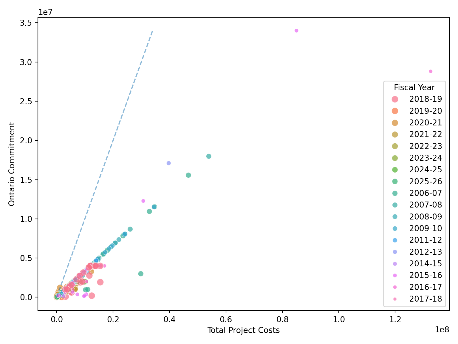
# convert to numeric for filtering, then convert back to a factor as plotting hack
plot_data_2021 = df.copy()
plot_data_2021["Fiscal Year"] = (
    plot_data_2021["Fiscal Year"]
    .str.replace(r"-\d{2}", "", regex=True)
    .astype(float)
)

plot_data_2021 = plot_data_2021.query("`Fiscal Year` > 2020")

plot_data_2021["Fiscal Year"] = plot_data_2021["Fiscal Year"].astype(int).astype(str)
fig, ax = plt.subplots(figsize=(8, 6))

sb.scatterplot(
    data=plot_data_2021,
    x="Total Project Costs",
    y="Ontario Commitment",
    hue="Fiscal Year",
    alpha=0.8,
    ax=ax
)


xmax = min(plot_data_2021["Total Project Costs"].max(), plot_data_2021["Ontario Commitment"].max())

ax.plot([0, xmax], [0, xmax], linestyle="--", alpha=0.4)

ax.set_title("Ontario Research Funding Costs and Commitments since 2021")

plt.tight_layout()

plt.show()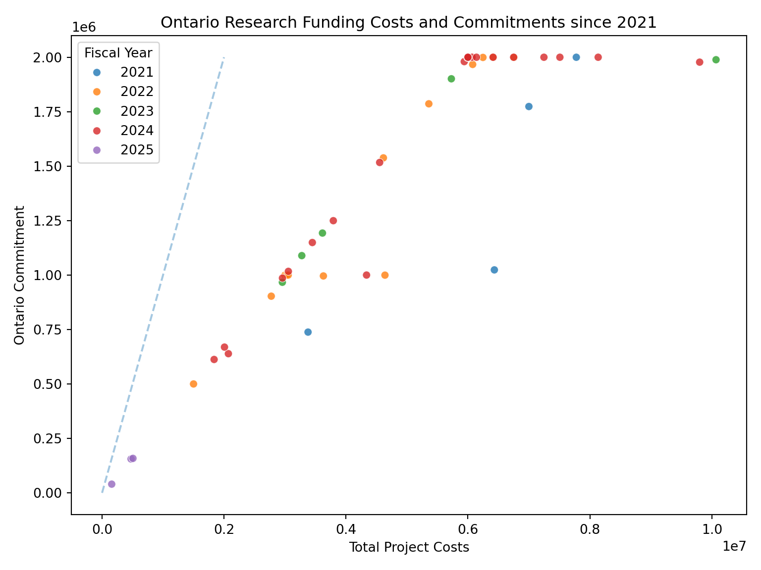
research_data_c = research_data_current |>
    subset(Program == "Ontario Research Fund - Research Excellence") |>
    subset(`Institution Type` == "University") |>
    select(`Total Project Costs`,`Ontario Commitment`, `Fiscal Year`)

research_data_h = research_data_historical |>
    subset(Program == "Ontario Research Fund - Research Excellence") |>
    subset(`Institution Type` == "University") |>
    select(`Total Project Costs`,`Ontario Commitment`, `Fiscal Year`)

research_data = bind_rows(research_data_c, research_data_h)


  research_data |>
    ggplot(aes(x = `Total Project Costs`, colour = `Fiscal Year`, y = `Ontario Commitment`)) +
  geom_abline(slope = 1, intercept = 0, alpha = .5, linetype = "dashed") +
  geom_point(alpha = .3)+
    ggtitle("Ontario Research Funding Costs and Commitments")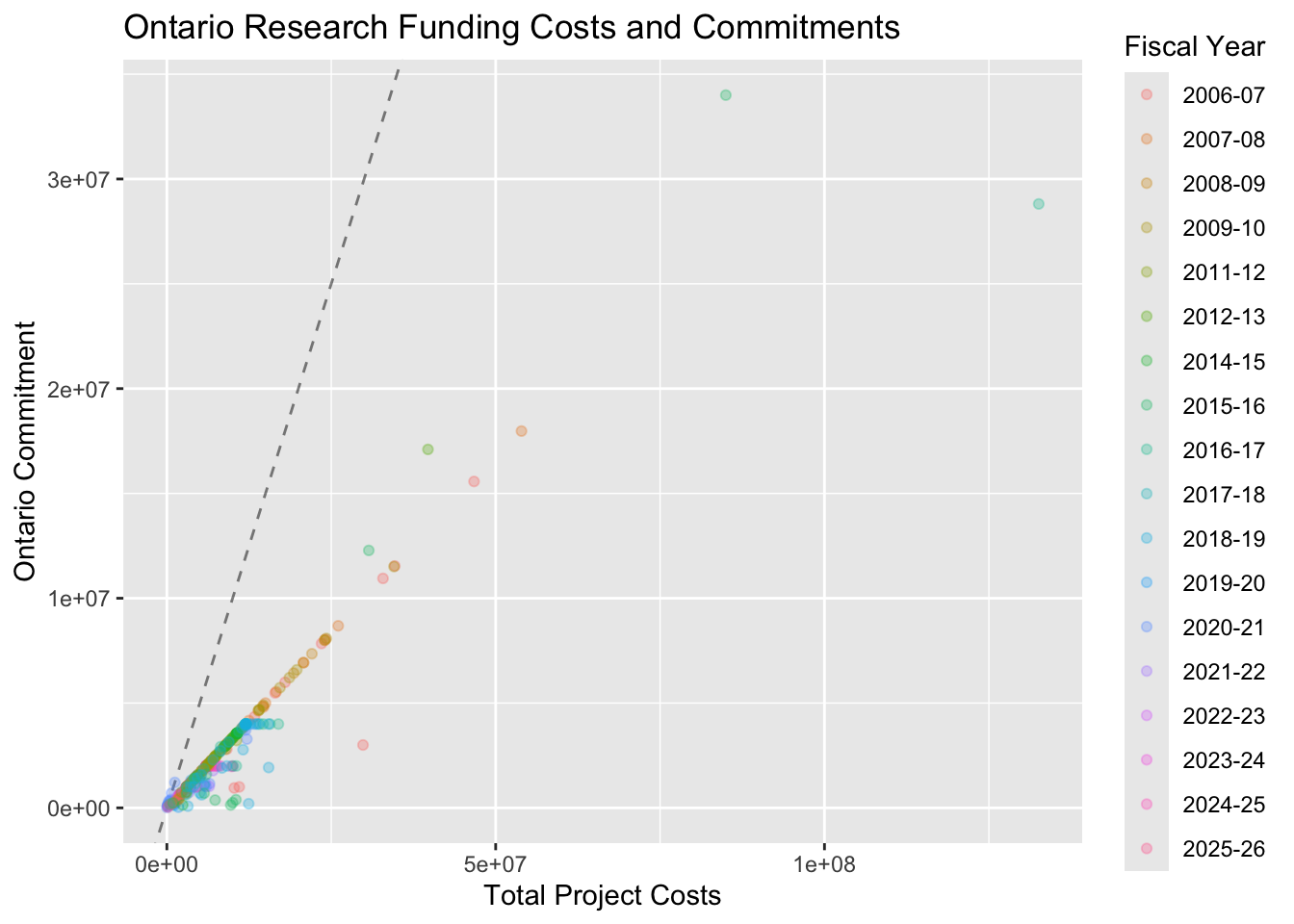
   research_data |>
    mutate(`Fiscal Year` = str_replace_all(`Fiscal Year`, pattern = "-\\d{2}", replacement = "") |> as.numeric()) |>
    dplyr::filter(`Fiscal Year` > 2020 ) |>  # convert to numeric for filtering, then convert back to a factor as plotting hack
    mutate(`Fiscal Year` = as.character(`Fiscal Year`)) |>
    ggplot(aes(x = `Total Project Costs`, colour = `Fiscal Year`, y = `Ontario Commitment`)) +
  geom_abline(slope = 1, intercept = 0, alpha = .4, linetype = "dashed") +
  geom_point(alpha = .8)+
    ggtitle("Ontario Research Funding Costs and Commitments since 2021")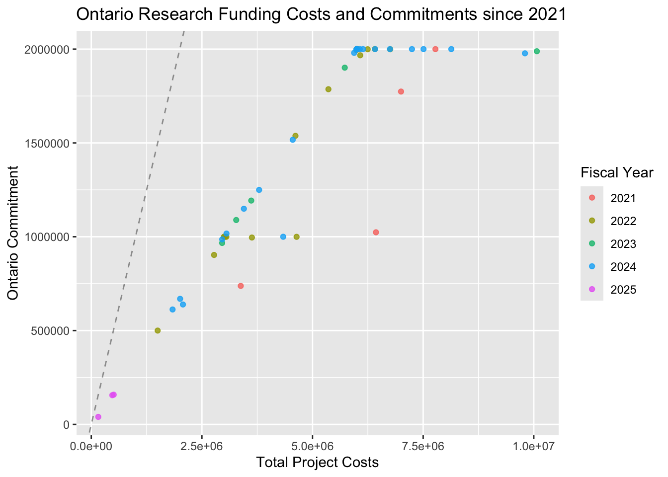
If Ontario was fully funding these research projects, then the points would fall on the dashed line. Considering 2021 and beyond, you can see that Ontario capped the projects to maximum contribution of $2,000,000 towards the total project costs.