import pandas as pd # data cleaning and organizing
import seaborn as sb # plotting
import matplotlib.pyplot as plt # plot managementCOVID Data: COVID-19 Data - Government of Canada and JHU CSSE
Data Provider - Worldwide
COVID-19 data plays a vital role in managing a pandemic. Johns Hopkins University Center for Systems Science and Engineering (JHU CSSE), ESRI Living Atlas Team and the Johns Hopkins University Applied Physics Lab (JHU APL) have compiled a COVID-19 data repository which is updated in real-time with worldwide COVID-19 data.
The real-time visual dashboard can be viewed in desktop and mobile.
Data Provider - Canada
COVID-19 is a serious health threat for individuals and its extended social problems are also evolving daily. Based on the given number of cases in Canada, the risk to Canadians is still considered high.
The government of Canada updates regular COVID-19 information and news here. It also creates interactive data visualizations by providing a visual data gallery here, so that everyone can easily see the current situation of COVID-19 across Canada and the world with different measurements. Health Canada provides several visualizations including the Canada COVID-19 Situational Awareness Dashboard and interactive data map.
COVID-19 Data from the Government of Canada
The COVID-19 data from the Government of Canada provide detailed information in number, percent, and rate data of tested, confirmed, recovered, and death cases in time series, it is also aggregated forms with a given date among different provinces and you can view and download the dataset here.
Libraries
library(reshape2)
library(gridExtra)
library(tidyverse)
── Attaching core tidyverse packages ──────────────────────── tidyverse 2.0.0 ──
✔ dplyr 1.1.4 ✔ readr 2.1.5
✔ forcats 1.0.0 ✔ stringr 1.5.1
✔ ggplot2 3.5.1 ✔ tibble 3.2.1
✔ lubridate 1.9.3 ✔ tidyr 1.3.1
✔ purrr 1.0.2
── Conflicts ────────────────────────────────────────── tidyverse_conflicts() ──
✖ dplyr::combine() masks gridExtra::combine()
✖ dplyr::filter() masks stats::filter()
✖ dplyr::lag() masks stats::lag()
ℹ Use the conflicted package (<http://conflicted.r-lib.org/>) to force all conflicts to become errorslibrary(lubridate)
library(ggpubr)Organizing Data
The following code is used to download and rearrange the original dataset from webpage.
# load the data and fix some of the data types
canadian_data = pd.read_csv("https://health-infobase.canada.ca/src/data/covidLive/covid19.csv")
canadian_data["date"] = pd.to_datetime(canadian_data["date"],
                                       dayfirst = True)
canadian_data["totalcases"] = pd.to_numeric(canadian_data["totalcases"],errors = 'coerce')
canadian_data.head()
pruid prname ... avgdeaths_last7 avgratedeaths_last7
0 59 British Columbia ... 0.0 0.0
1 48 Alberta ... 0.0 0.0
2 47 Saskatchewan ... 0.0 0.0
3 46 Manitoba ... 0.0 0.0
4 35 Ontario ... 0.0 0.0
[5 rows x 23 columns]# load the data and fix some of the data types
Canadian.data <- read_csv("https://health-infobase.canada.ca/src/data/covidLive/covid19.csv") |>
mutate(date = as_date(date, format = "%d-%m-%Y"))|>
mutate(totalcases = as.numeric(totalcases))Rows: 3615 Columns: 23
── Column specification ────────────────────────────────────────────────────────
Delimiter: ","
chr (11): prname, prnameFR, date, totalcases, numtotal_last7, ratecases_tota...
dbl (12): pruid, reporting_week, reporting_year, update, numdeaths, numdeath...
ℹ Use `spec()` to retrieve the full column specification for this data.
ℹ Specify the column types or set `show_col_types = FALSE` to quiet this message.Warning: There was 1 warning in `mutate()`.
ℹ In argument: `totalcases = as.numeric(totalcases)`.
Caused by warning:
! NAs introduced by coercionCanadian.data|> head()# A tibble: 6 × 23
pruid prname prnameFR date reporting_week reporting_year update
<dbl> <chr> <chr> <date> <dbl> <dbl> <dbl>
1 59 British Columb… Colombi… 2020-02-08 6 2020 1
2 48 Alberta Alberta 2020-02-08 6 2020 1
3 47 Saskatchewan Saskatc… 2020-02-08 6 2020 1
4 46 Manitoba Manitoba 2020-02-08 6 2020 1
5 35 Ontario Ontario 2020-02-08 6 2020 1
6 24 Quebec Québec 2020-02-08 6 2020 1
# ℹ 16 more variables: totalcases <dbl>, numtotal_last7 <chr>,
# ratecases_total <chr>, numdeaths <dbl>, numdeaths_last7 <dbl>,
# ratedeaths <dbl>, ratecases_last7 <chr>, ratedeaths_last7 <dbl>,
# numtotal_last14 <chr>, numdeaths_last14 <dbl>, ratetotal_last14 <chr>,
# ratedeaths_last14 <dbl>, avgcases_last7 <chr>, avgincidence_last7 <chr>,
# avgdeaths_last7 <dbl>, avgratedeaths_last7 <dbl>Total COVID-19 Cases
Let’s start by looking at total cases.
sb.set_style("darkgrid")

canada_total = sb.lineplot(data = canadian_data[(canadian_data["prname"] == "Canada")],
                           x = "date",
                           y = "totalcases")

plt.title("Total Covid-19 Case Count in Canada")
plt.xlabel("Date")
plt.ylabel("Total Cases")
plt.show()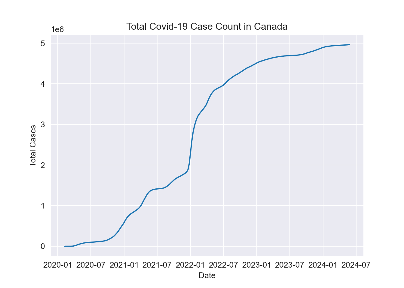
plt.clf()
provinces_total = sb.lineplot(data = canadian_data[(canadian_data["prname"] != "Canada") &
                                                   (canadian_data["prname"] != "Repatriated travellers")],
                              x = "date",
                              y = "totalcases",
                              hue = "prname")

plt.title("Total Covid-19 Case Count by Province")
plt.xlabel("Date")
plt.ylabel("Total Cases")
plt.legend(title = "Province",
           loc = 'upper left')
plt.show();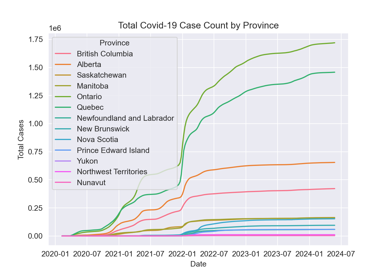
location = "Canada"

Canadian.data |> subset(prname == location) |>
  select(date,totalcases)|>
  ggplot( ) +
  geom_line(aes(x = date, y=totalcases)) +
  ylab("Total Cases") +
  xlab("Year") +
  ggtitle(paste0("Total Covid-19 Case Count in Canada"))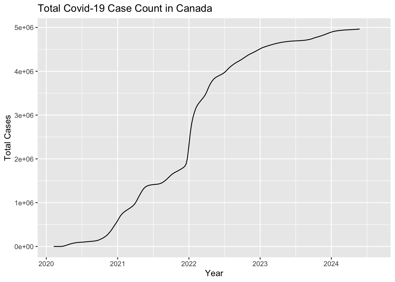
Canadian.data |> subset(prname != location & prname != "Repatriated travellers") |>
  ggplot( ) +
  geom_line(aes(x = date, y=totalcases, colour=prname)) +
  ylab("Total Cases") +
  xlab("Year") +
  ggtitle(paste0("Total Covid-19 Case Count by Province"))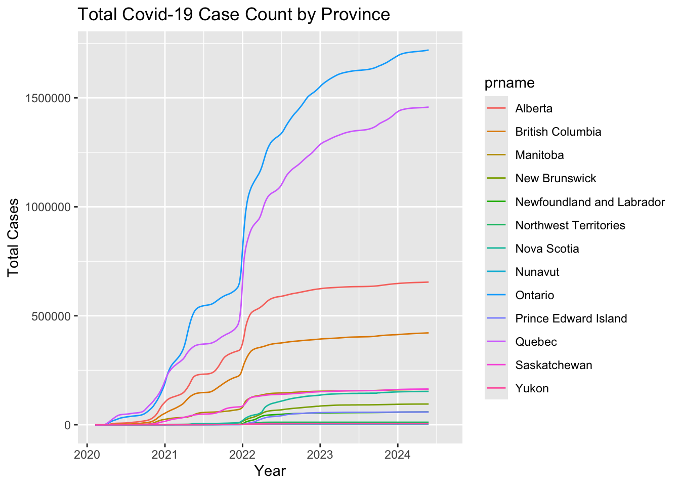
Looking at the case count broken down by province we can see that the Canadian trend is largely driven by Ontario and Quebec. This is to be expected as these provinces account for over half the population of the country.
Seasonal Trends
Total cases can be expected to increase indefinitely but of more interest is how Covid-19 will settle into a yearly pattern, much like the seasonal cold and flu.
plt.clf()

sb.lineplot(data = canadian_data[(canadian_data["prname"] == "Canada")],
            x = "date",
            y = "numdeaths_last7")

plt.title("Covid-19 Deaths by Week in Canada")
plt.xlabel("Date")
plt.ylabel("Covid-19 Deaths in Last 7 Days")

plt.show();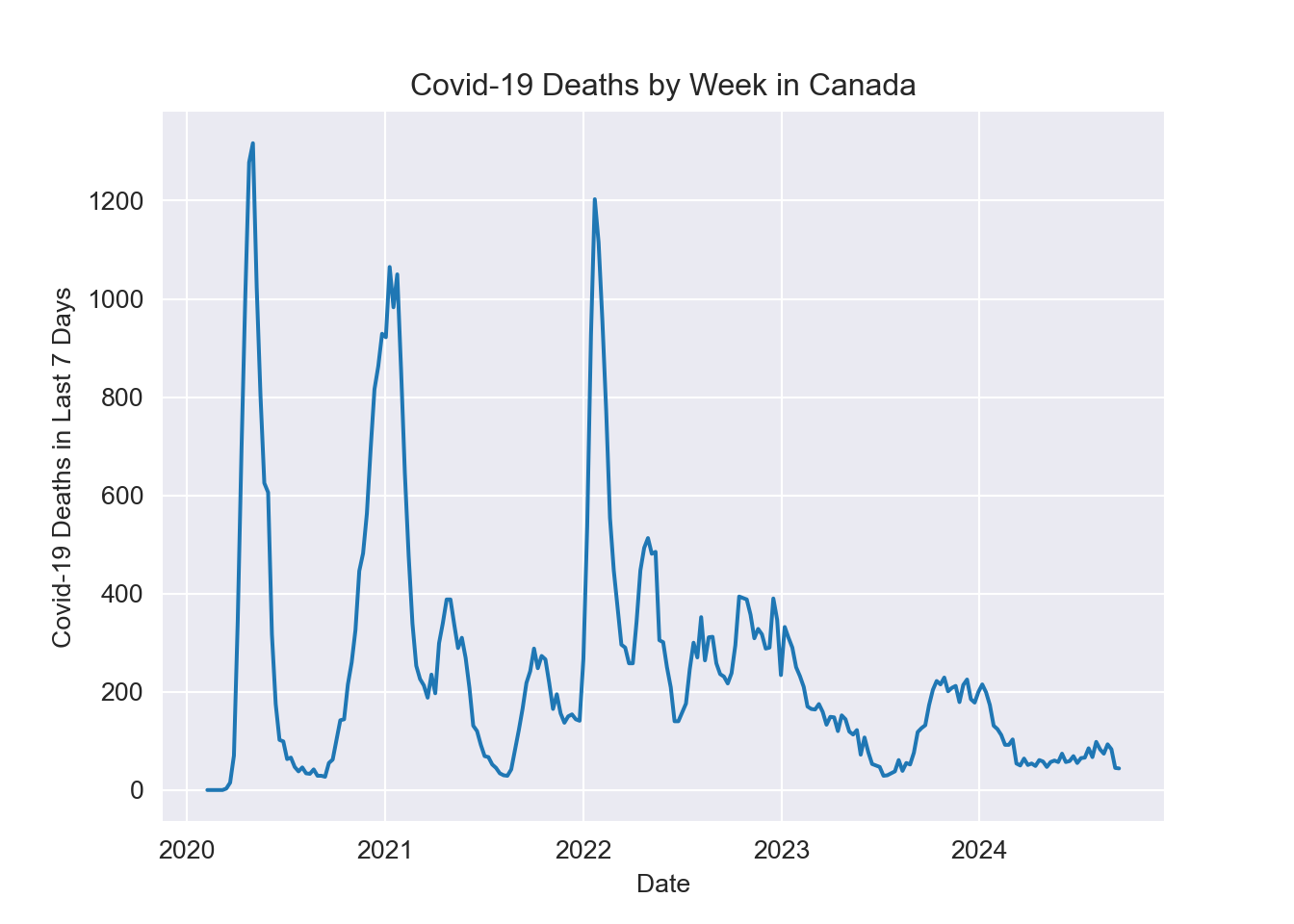
Canadian.data |> subset(prname == location) |>
  select(date,numdeaths_last7)|>
  ggplot( ) +
  geom_line(aes(x = date, y=numdeaths_last7)) +
  ylab("Covid-19 Deaths in Last 7 Days") +
  xlab("Year") +
  ggtitle(paste0("Covid-19 Deaths by Week in Canada"))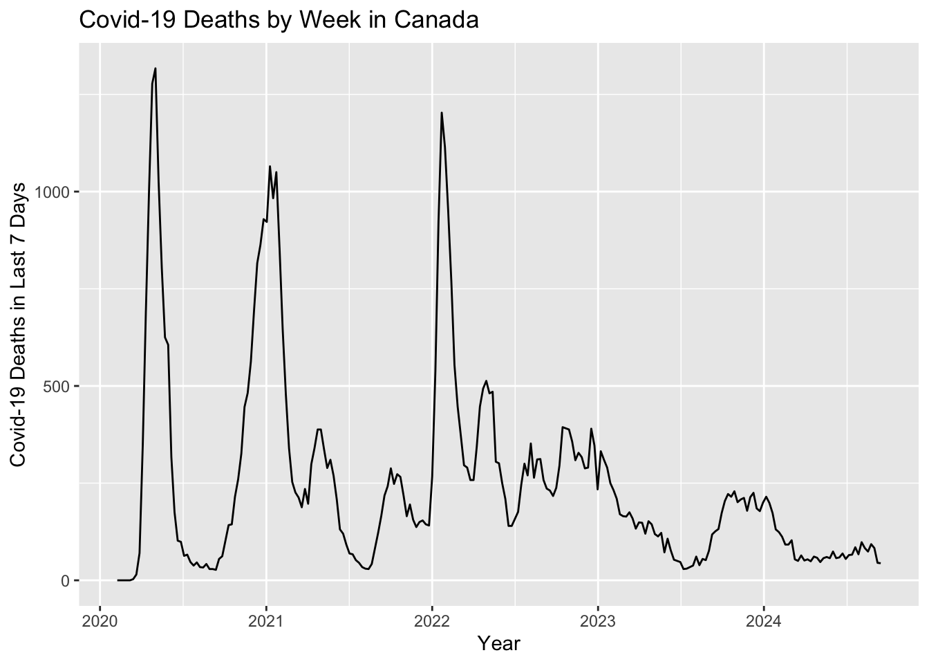
As predicted, Covid-19 deaths appear to follow a yearly pattern peaking during cold and flu season. 2023 and 2024 observed a large drop off Covid-19 deaths, possibly due to higher vaccination rates and increased awareness.
plt.clf()

sb.lineplot(data = canadian_data[(canadian_data["prname"] != "Canada") &
                                 (canadian_data["prname"] != "Repatriated travellers")],
            x = "date",
            y = "numdeaths_last7",
            hue = "prname")

plt.title("Covid-19 Deaths by Week in Provinces")
plt.xlabel("Date")
plt.ylabel("Covid-19 Deaths in Last 7 Days")

plt.legend(title = "Province",
           bbox_to_anchor=(1.05, 1),
           loc='upper left',
           borderaxespad=0)

plt.show();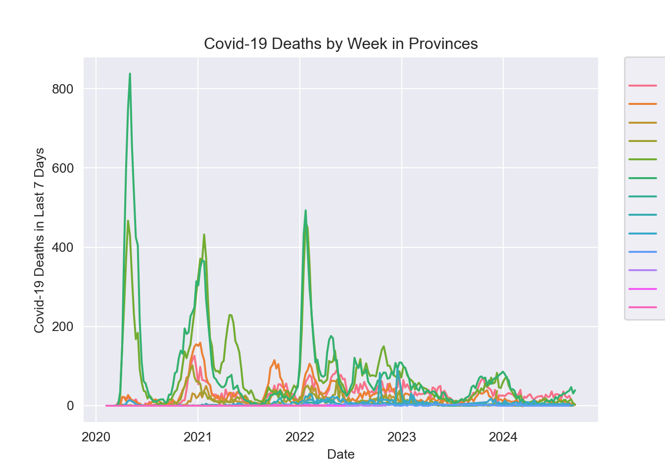
Canadian.data |> subset(prname != location & prname != "Repatriated travellers") |>
  select(date,numdeaths_last7, prname)|>
  ggplot( ) +
  geom_line(aes(x = date, y=numdeaths_last7, colour=prname)) +
  ylab("Covid-19 Deaths in Last 7 Days") +
  xlab("Year") +
  ggtitle(paste0("Covid-19 Deaths by Week by Province"))
Warning: Removed 396 rows containing missing values or values outside the scale range
(`geom_line()`).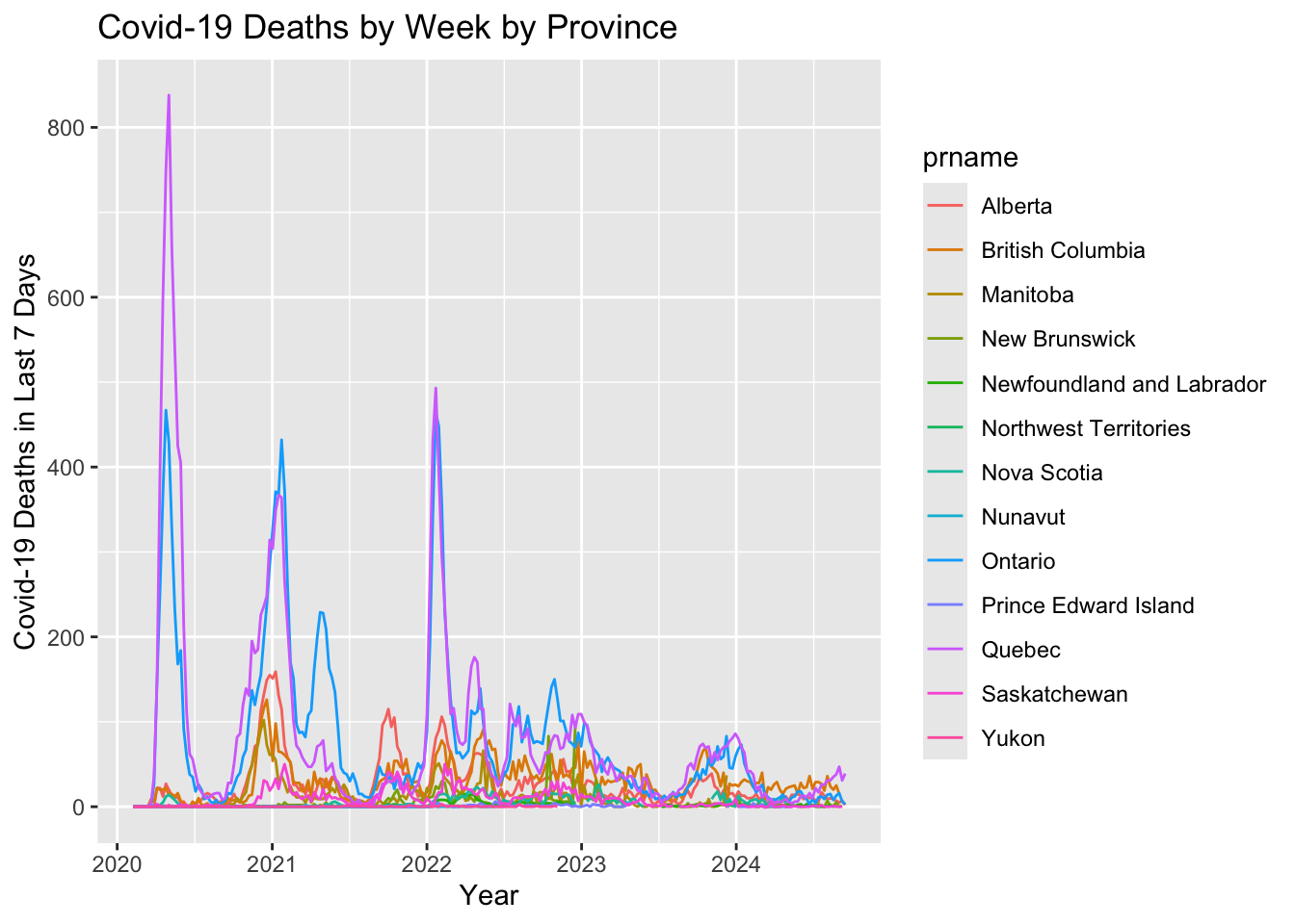
As with the total case count, the Canada wide trend seems to be driven by the Ontario and Quebec seasonal trends.