Possible Analysis and Keywords
- Paired Plot
- Histogram Graph
- Time Series
- Ridgeline Graph
- Research Fund
- Education Data
Data Provider
The provincial government of Ontaio provides open access to thousands of data sets via their Open Data Ontario portal. The purpose of sharing all data documents with the public is to remain transparent and accessible. More details about the data license, training materials, and other information can be found here.
Ontario Research Fund - Research Excellence Program
This Ontario Research Fund dataset includes research projects funded through the Research Excellence Program from 2003 to 2018. The first row of the dataset provides the column names. The variables include research program titles and descriptions, approval date, lead research institution and city where the institution located, total project costs, and Ontario funding commitment.
The dataset and its supporting document can be found here and you can quickly preview the CSV dataset file here. Moreover, The legend description can be viewed here
Exprolary Analysis
Organizing Dataset
The following code is used to download the dataset, pick important variables to form a new dataset and convert some variables from character format into their specific one.
The head of the well-organized dataset is shown at the end of the code and from that, we can easily found those most important variables. After forming the new dataset, the rest of the paper is going to use this dataset to create some graphs.
# library
library(tidyverse)
library(lubridate)
library(viridis)
library(hrbrthemes)
library(ggridges) # for geom_density_ridges()

# Download the CSV file and organize the dataset
data <- read_csv("https://files.ontario.ca/opendata/orfre_apr_20_18_0.csv", skip=1)


# Get rid of empty rows and change the formats of date and currency variables
data <- data |> rename_all(make.names)|>
  subset(Program!="") |>
  mutate(Ontario.Commitment = as.numeric(gsub("[$,]", "", Ontario.Commitment))) |>
  mutate(Total.Project.Costs = as.numeric(gsub("[$,]", "", Total.Project.Costs))) |>
  mutate(Approval.Date = as.Date(Approval.Date, "%d-%b-%y"))
head(data)
## # A tibble: 6 × 21
## Program Project.Number Project.Title Project.Description Area.Primary
## <chr> <chr> <chr> <chr> <chr>
## 1 ORF RE RE01-076 Structural and Fun… "Dr. Robert Hegele, a… 4.1
## 2 ORF RE RE01-025 Intelligent Multip… "Global wireless tele… 7.6.2
## 3 ORF RE RE01-063 The Ontario BioCar… "Manufacturing and po… 7.5.2
## 4 ORF RE RE01-065 SHARCNET: New Oppo… "The Shared Hierarchi… 7.6.3
## 5 ORF RE RE01-067 Centre for Brain a… "Dr. Melvyn A. Goodal… 4.1
## 6 ORF RE RE01-027 Thermo-mechanical … "Hydrogen has potenti… 5.7
## # … with 16 more variables: Area.Secondary <chr>, Discipline.Primary <dbl>,
## # Discipline.Secondary <dbl>, Round <chr>, Approval.Date <date>,
## # Lead.Research.Institution <chr>, City <chr>, Ontario.Commitment <dbl>,
## # Total.Project.Costs <dbl>, Keyword <chr>, EXPENDITURE_TYPE <chr>,
## # Salutation <chr>, First_Name <chr>, Middle_Name <chr>, Last_Name <chr>,
## # OIA_AREA <chr># Plot the Paired graph
#extract the year from the approval date
data |>
separate(Approval.Date, into = c("year","month", "date"), sep = "-")|>
ggplot( )+
#geom_point(aes(x=year, y=Ontario.Commitment))+
geom_boxplot(aes(y=Ontario.Commitment, x=factor(year)))+
ggtitle("Funding per Year (From Ontario)")+
labs(y="Dollars of funding", x = "Year of approval")+
theme(axis.text.x = element_text(angle = 90, vjust = 0.5, hjust=1))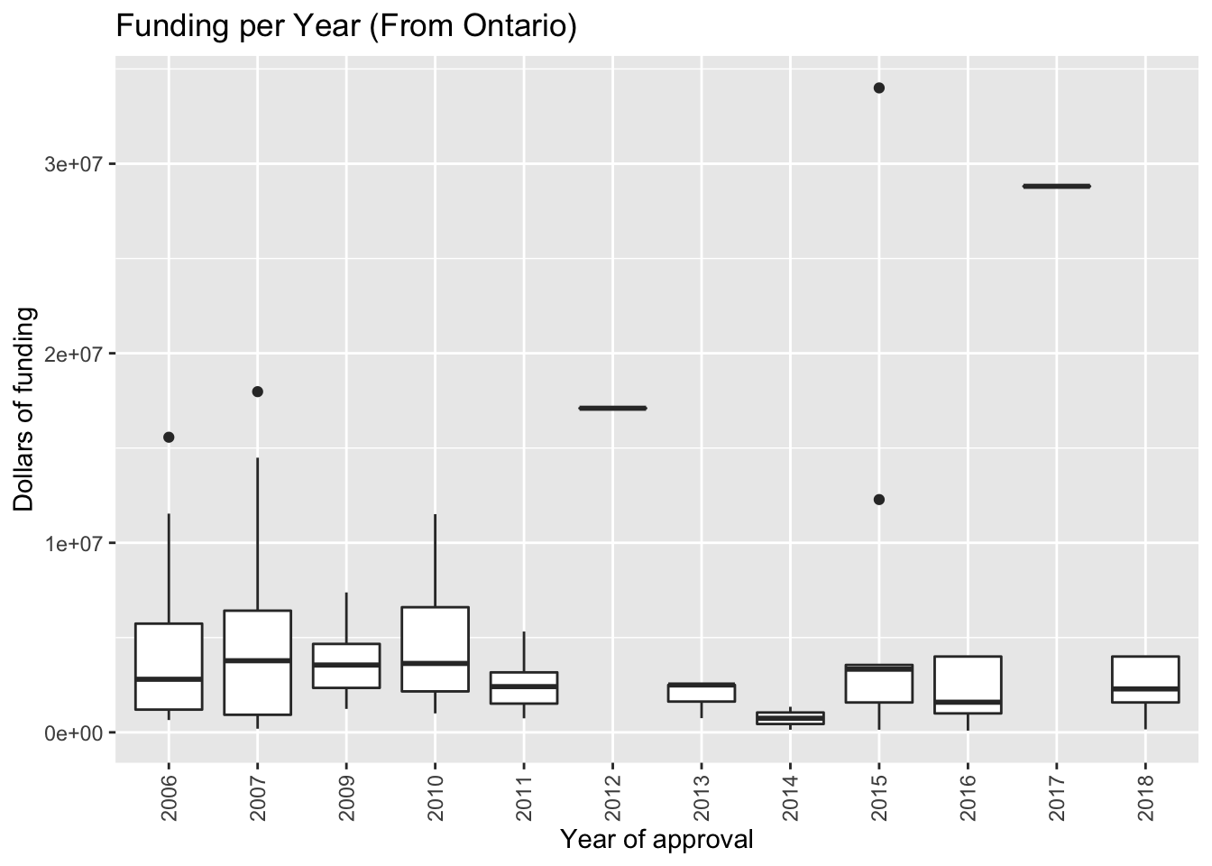
- The graph shows that most of the projects were for $1,000,000 - $4,000,000 Canadian dollars.
Frequency of Study Area
The following code is used to draw the different research areas funding. Note that first we need to sum within each category (OIA_AREA) and then fill in the table so that we have zeros in all the missing years.
data |>
  separate(Approval.Date, into = c("year","month", "date"), sep = "-")|>
  group_by(year,OIA_AREA) |>
  summarize(TotalFunding = sum(Ontario.Commitment))|>
  ungroup()|>
  complete(OIA_AREA,year,fill = list(TotalFunding = 0))|>
ggplot( aes(x=year, y=TotalFunding, group=OIA_AREA )) +
  geom_line(aes(color = OIA_AREA)) +
  ggtitle("Total Funding Per Year Within Each Category")+
   theme(axis.text.x = element_text(angle = 90, vjust = 0.5, hjust=1))
## `summarise()` has grouped output by 'year'. You can override using the `.groups` argument.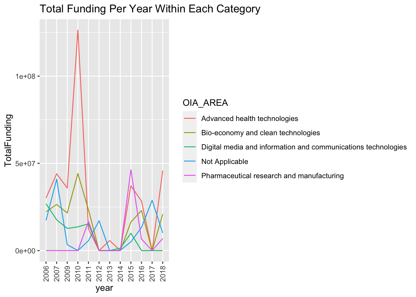
Summary
- Research programs are separated into 5 areas: Advanced health technologies, Bio-economy and clean technologies, Digital media information and communications technologies, Pharmaceutical research and manufacturing, and other unspecified groups.
# percentage of study are in research fund
data |>
  separate(Approval.Date, into = c("year","month", "date"), sep = "-")|>
  group_by(year,OIA_AREA) |>
  summarize(TotalFunding = sum(Ontario.Commitment))|>
  ungroup()|>
  complete(OIA_AREA,year,fill = list(TotalFunding = 0))|>
ggplot( aes(x = year,fill=OIA_AREA, y=TotalFunding)) +
    geom_bar(position="fill", stat="identity") +
    scale_fill_viridis(discrete = T) +
    ggtitle("Funding proportion in each research area ") +
    theme_ipsum() +
    xlab("year")+
    ylab("proportion of funding")+
   theme(axis.text.x = element_text(angle = 90, vjust = 0.5, hjust=1))
## `summarise()` has grouped output by 'year'. You can override using the `.groups` argument.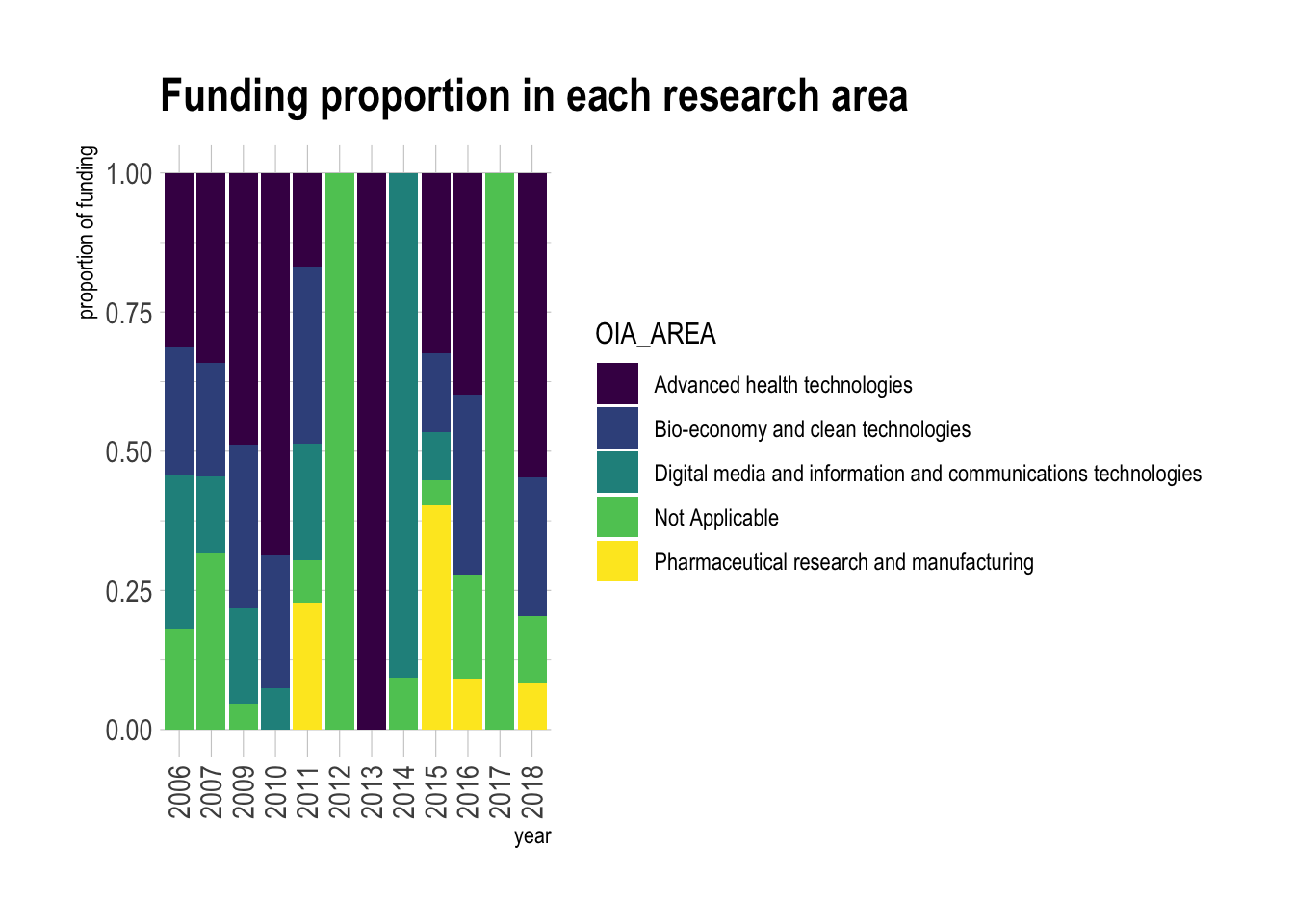
Frequency distribution of research projects grouped by cities and Lead Research Institutions
The following codes are used to plot the ridgeline graphs about the frequency of research projects by cities and Lead Research Institutions.
# Create thier own summarized table

ins = data |>
  separate(Approval.Date, into = c("year","month", "date"), sep = "-")|>
  group_by(year,Lead.Research.Institution) |>
  tally() |>
  ungroup()|>
  complete(Lead.Research.Institution,year, fill = list(n = 0))

city = data |>
  separate(Approval.Date, into = c("year","month", "date"), sep = "-")|>
  group_by(year,City) |>
  tally()|>
  ungroup()|>
  complete(City,year, fill = list(n = 0))


# Plot their ridgeline graphs
ins |>
  ggplot(aes(y=Lead.Research.Institution, x=n,  fill=Lead.Research.Institution)) +
    geom_density_ridges(alpha=0.6, stat="binline", bins=20) +
    theme_ridges() +
    theme(legend.position="none",
          panel.spacing = unit(0.1, "lines"),
          strip.text.x = element_text(size = 3)) +
    xlab("Number of approved research projects in a year") +
    ylab("Lead Research Institution")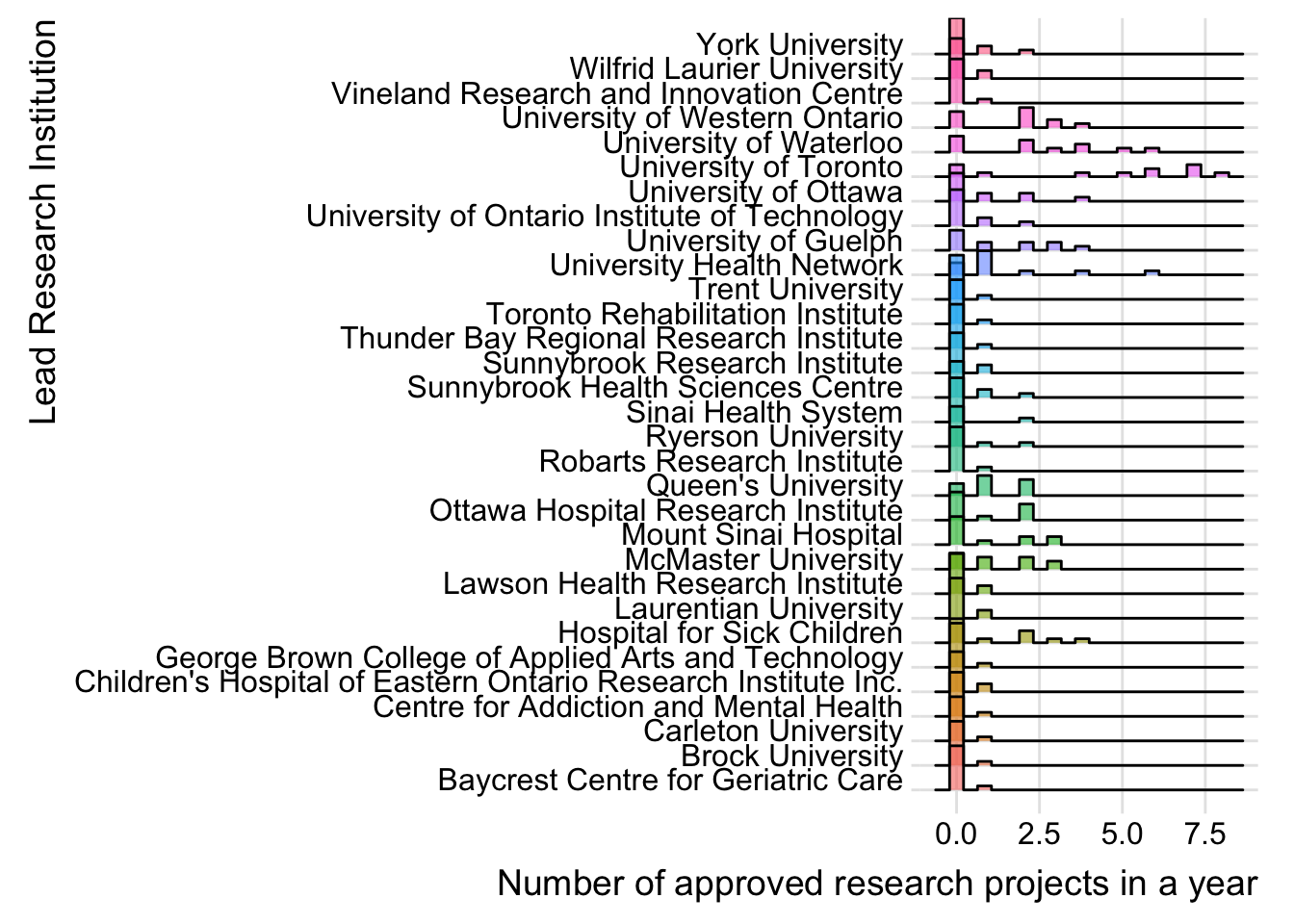
city |>
  ggplot(aes(y=City, x=n,  fill=City)) +
    geom_density_ridges(alpha=0.6, stat="binline", bins=20) +
    theme_ridges() +
    theme(legend.position="none",
          panel.spacing = unit(0.1, "lines"),
          strip.text.x = element_text(size = 3)) +
    xlab("Number of approved research projects in a year") +
    ylab("City")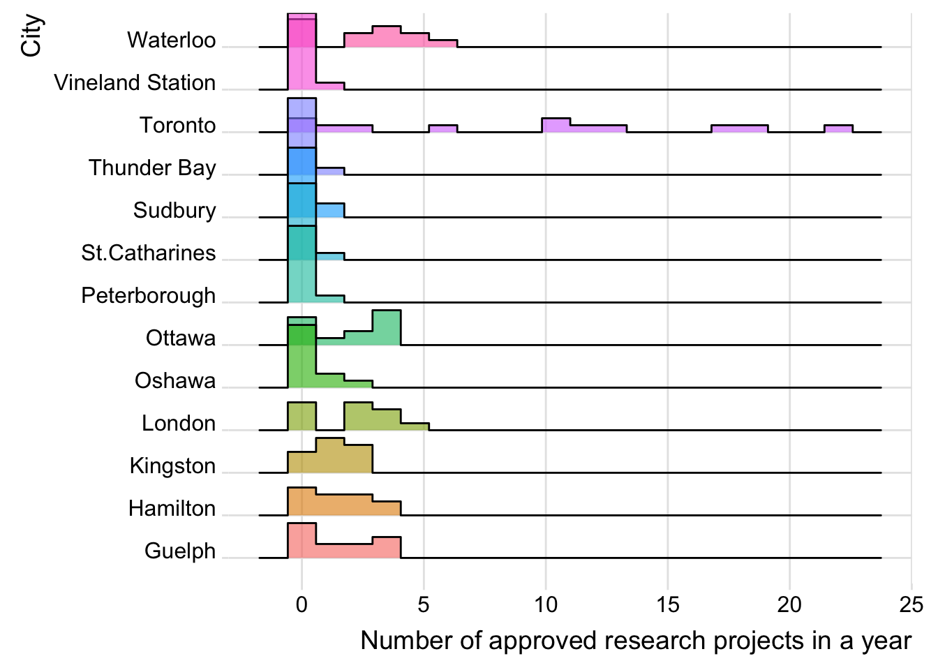
Summary
- The graph counts the number of approved projects by cities and Lead Research Institutions, essentially a histogram of approvals within each year. There are many years in which the values are zero for a city or institution so these must be re-included, otherwise the data will be misleading.