Possible Analysis and Keywords
- Linear Regression
- Normal Distribution
- Time Series
- Aggregated Data
- Spatial Data Set
- COVID-19
- COVID Data
Data Provider - Worldwide
COVID-19 data plays a vital role in managing a pandemic. Johns Hopkins University Center for Systems Science and Engineering (JHU CSSE), ESRI Living Atlas Team and the Johns Hopkins University Applied Physics Lab (JHU APL) have compiled a COVID-19 data repository which is updated in real-time with worldwide COVID-19 data.
The real-time visual dashboard can be viewed in desktop and mobile.
Data Provider - Canada
COVID-19 is a serious health threat for individuals and its extended social problems are also evolving daily. Based on the given number of cases in Canada, the risk to Canadians is still considered high.
The government of Canada updates regular COVID-19 information and news here, it also creates interactive data visualizations by providing a visual data gallery here, so that everyone can easily see the current situation of COVID-19 across Canada and the world with different measurements. Health Canada provides several visualizations including the Canada COVID-19 Situational Awareness Dashboard and interactive data map.
COVID-19 Data from the Government of Canada
The COVID-19 data from the Government of Canada provide detailed information in number, percent, and rate data of tested, confirmed, recovered, and death cases in time series, it is also aggregated forms with a given date among different provinces and you can view and download the dataset here.
Organizing Data
The following code is used to download and rearrange the original dataset from webpage.
library(reshape2)
library(gridExtra)
library(tidyverse)
## ── Attaching packages ─────────────────────────────────────── tidyverse 1.3.1 ──## ✓ ggplot2 3.3.5 ✓ purrr 0.3.4
## ✓ tibble 3.1.4 ✓ dplyr 1.0.7
## ✓ tidyr 1.1.3 ✓ stringr 1.4.0
## ✓ readr 2.0.1 ✓ forcats 0.5.1## ── Conflicts ────────────────────────────────────────── tidyverse_conflicts() ──
## x dplyr::combine() masks gridExtra::combine()
## x dplyr::filter() masks stats::filter()
## x dplyr::lag() masks stats::lag()library(lubridate)##
## Attaching package: 'lubridate'## The following objects are masked from 'package:base':
##
## date, intersect, setdiff, unionlibrary(ggpubr)
Canadian.data <- read_csv("https://health-infobase.canada.ca/src/data/covidLive/covid19.csv") |>
mutate(date = as_date(date, format = "%d-%m-%Y"))## Rows: 8562 Columns: 40## ── Column specification ────────────────────────────────────────────────────────
## Delimiter: ","
## chr (4): prname, prnameFR, date, percentrecover
## dbl (36): pruid, update, numconf, numprob, numdeaths, numtotal, numtested, n...##
## ℹ Use `spec()` to retrieve the full column specification for this data.
## ℹ Specify the column types or set `show_col_types = FALSE` to quiet this message.Summary
We use mutate to modify a column. Its arguments are of the form new.column.name=function.of.old.column.names.
the lubridate package includes a lot of functionality for dealing with dates. Here we use it to convert a character column into date format.
Different Characteristics of COVID-19 Cases
Consider the number of case types in a province over the past few months
location ="Ontario"
Canadian.data |> subset(prname == location) |>
  select(date,numrecoveredtoday,numdeathstoday,numactive)|>
  rename(recovered.today=numrecoveredtoday,deaths.today=numdeathstoday,active=numactive)|>
  gather(key = casetype, value = "cases",-date) |>
ggplot( ) +
  geom_line(aes(x = date, y=cases,colour=casetype)) +
  scale_x_date(date_labels = "%d/%m", date_breaks = "2 weeks") +
  ggtitle(paste0("Daily Cases in ",location))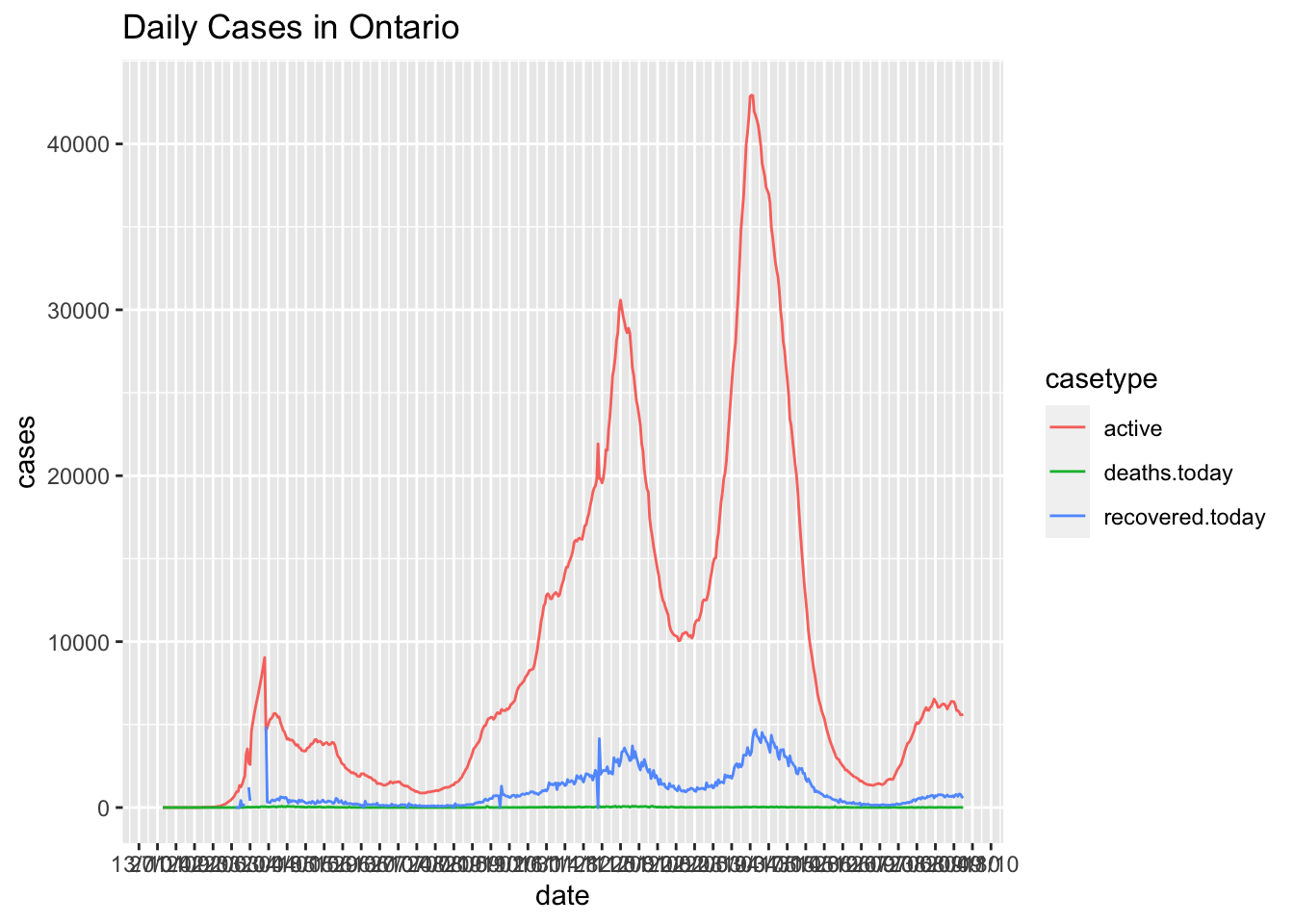
Canadian.data |> subset(prname == location) |>
  select(date,
         numtotal_last14, numdeaths_last14)|>
  gather(key = casetype, value = "cases",-date) |>
ggplot( ) +
  geom_line(aes(x = date, y=cases,colour=casetype)) +
  scale_x_date(date_labels = "%d/%m", date_breaks = "2 weeks") +
  ggtitle(paste0("Daily Cases in ",location, " 14 day totals"))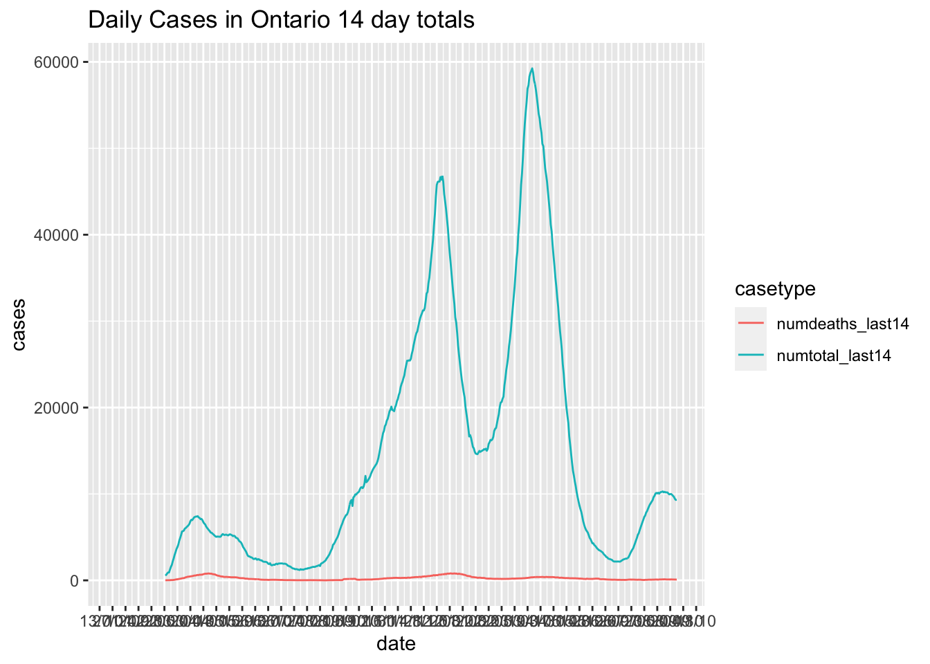
Canadian.data |> subset(prname == location) |>
  select(date,numconf,numdeaths,numrecover)|>
  mutate(Recovered.plus.Deaths = numdeaths+numrecover)|>
  gather(key = casetype, value = "cases",-date) |>
ggplot( ) +
  geom_line(aes(x = date, y=cases,colour=casetype)) +
  scale_x_date(date_labels = "%d/%m", date_breaks = "2 weeks") +
  ggtitle(paste0("Cumulative cases in ",location))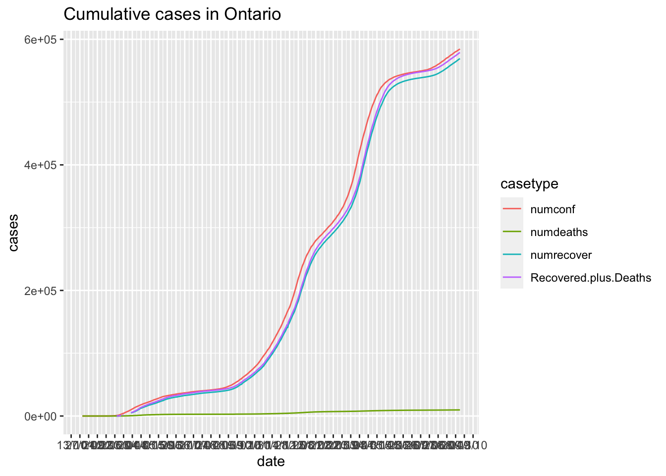
Canadian.data |> subset(prname == location) |>
  select(date,numtestedtoday,numtoday)|>
    gather(key = casetype, value = "cases",-date) |>
ggplot( ) +
  geom_line(aes(x = date, y=cases,colour=casetype)) +
  scale_x_date(date_labels = "%d/%m", date_breaks = "2 weeks") +
  ggtitle(paste0("Number of tests and new cases per day in ",location))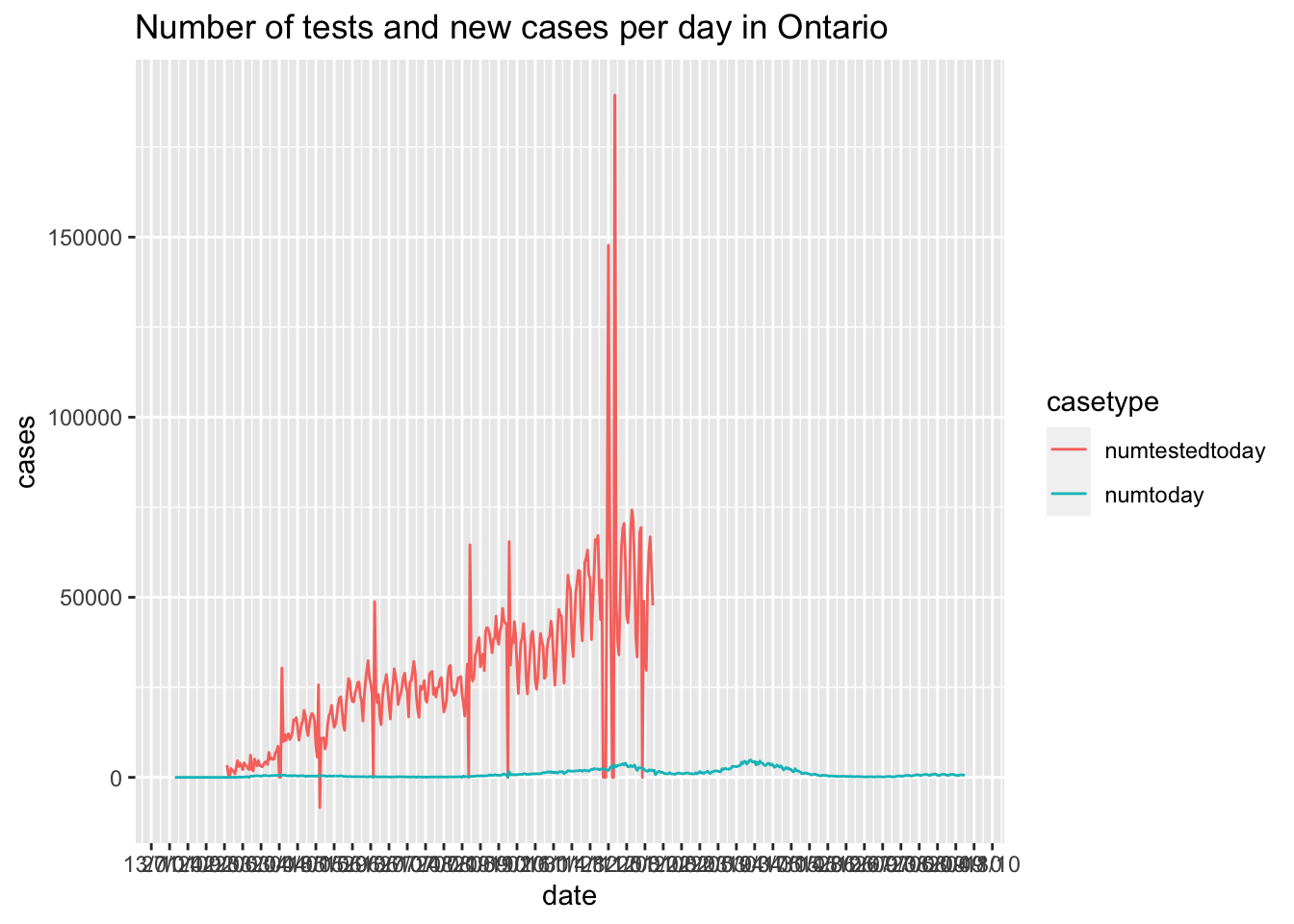
Make each plot its own facet.
Look closely at the vertical scales in these plots.
Canadian.data |> subset(prname == location) |>
  select(date,numtestedtoday,numtoday,numdeathstoday,numrecoveredtoday) |>
  gather(key = casetype, value = "cases",-date) |>
ggplot( ) +
  geom_line(aes(x = date, y=cases,colour=casetype)) +
  scale_x_date(date_labels = "%d/%m", date_breaks = "2 weeks") +
  ggtitle(paste0("Number of tests and new cases per day in ",location))+
    facet_grid(rows = vars(casetype))
## Warning: Removed 287 row(s) containing missing values (geom_path).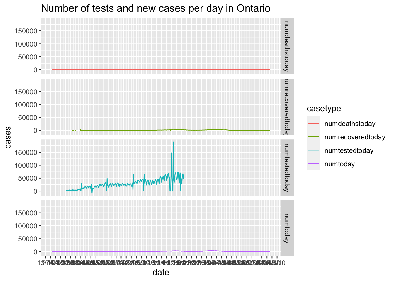
Adjusting the scales.
Alternatively we can make each figure with its own scale and ggarrange them together.
data2use = Canadian.data |> subset(prname == location) |>
  select(date,numtestedtoday,numtoday,numdeathstoday,numrecoveredtoday)
#  gather(key = casetype, value = "cases",-date)


p1 = data2use |>
ggplot( ) +
  geom_line(aes(x = date, y=numtestedtoday),colour="red") +
  scale_x_date(date_labels = "%d/%m", date_breaks = "4 weeks") +
  ggtitle(paste0("Number of tests in ",location))


p2 = data2use |>
ggplot( ) +
  geom_line(aes(x = date, y=numtoday),colour="blue") +
  scale_x_date(date_labels = "%d/%m", date_breaks = "4 weeks") +
  ggtitle(paste0("Number of new cases in ",location))


p3 = data2use |>
ggplot( ) +
  geom_line(aes(x = date, y=numdeathstoday),colour="green") +
  scale_x_date(date_labels = "%d/%m", date_breaks = "4 weeks") +
  ggtitle(paste0("Number of deaths day in ",location))


p4 = data2use |>
ggplot( ) +
  geom_line(aes(x = date, y=numrecoveredtoday),colour="black") +
  scale_x_date(date_labels = "%d/%m", date_breaks = "4 weeks") +
  ggtitle(paste0("Number recovered day in ",location))


ggarrange(p1, p2, p3, p4,
                    ncol = 2, nrow = 2)
## Warning: Removed 256 row(s) containing missing values (geom_path).## Warning: Removed 31 row(s) containing missing values (geom_path).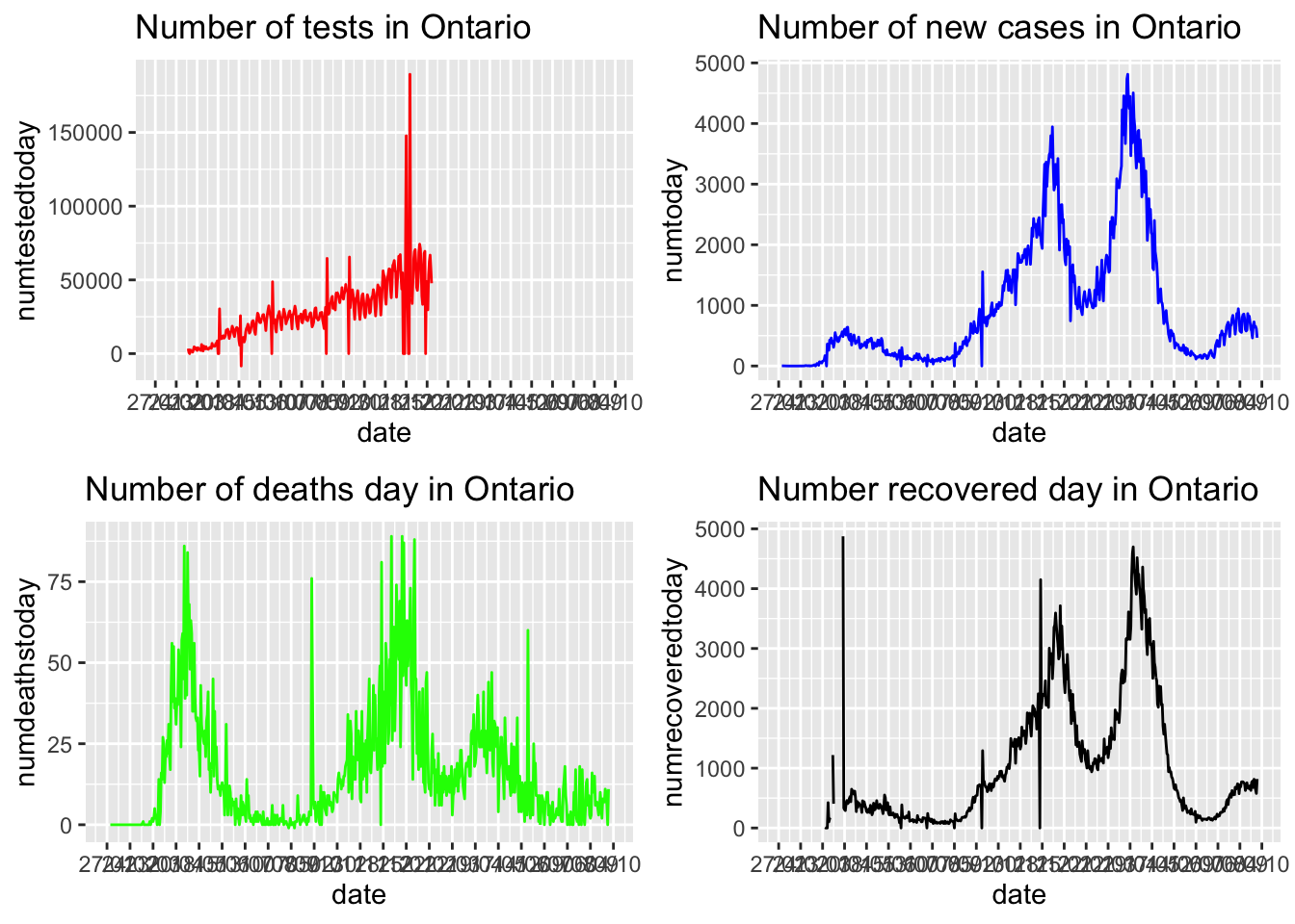
We can also transform the vertical scale
Canadian.data |> subset(prname == location) |>
  select(date,numtestedtoday,numtoday,numdeathstoday,numrecoveredtoday) |>
ggplot( ) +
  geom_line(aes(x = date, y=numdeathstoday),colour="red") +
  scale_y_log10()+
  scale_x_date(date_labels = "%d/%m", date_breaks = "4 weeks") +
  ggtitle(paste0("Log Number of Deaths in ",location))
## Warning in self$trans$transform(x): NaNs produced## Warning: Transformation introduced infinite values in continuous y-axis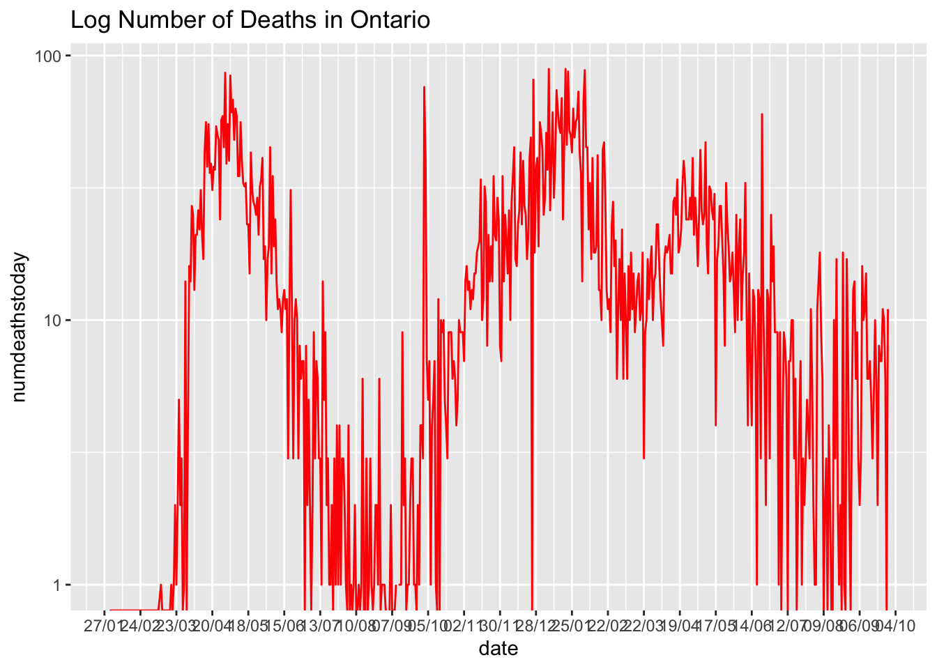
Ontario School Covid reports:
Ontario keeps records of the number of cases in different schools. Here we will directly download the latest data from today
school = read_csv("https://data.ontario.ca/dataset/b1fef838-8784-4338-8ef9-ae7cfd405b41/resource/8b6d22e2-7065-4b0f-966f-02640be366f2/download/schoolsactivecovid.csv")## Rows: 70053 Columns: 10## ── Column specification ────────────────────────────────────────────────────────
## Delimiter: ","
## chr (4): school_board, school_id, school, municipality
## dbl (4): confirmed_student_cases, confirmed_staff_cases, confirmed_unspecif...
## date (2): collected_date, reported_date##
## ℹ Use `spec()` to retrieve the full column specification for this data.
## ℹ Specify the column types or set `show_col_types = FALSE` to quiet this message.school |> glimpse()## Rows: 70,053
## Columns: 10
## $ collected_date <date> 2020-09-10, 2020-09-10, 2020-09-10, 2020-…
## $ reported_date <date> 2020-09-11, 2020-09-11, 2020-09-11, 2020-…
## $ school_board <chr> "Conseil des écoles catholiques du Centre-…
## $ school_id <chr> "753203", "793027", "860573", "734314", "7…
## $ school <chr> "École élémentaire catholique Roger-Saint-…
## $ municipality <chr> "Ottawa", "Ottawa", "Ottawa", "Ottawa", "O…
## $ confirmed_student_cases <dbl> 0, 1, 1, 1, 1, 0, 0, 0, 0, 0, 0, 0, 0, 0, …
## $ confirmed_staff_cases <dbl> 1, 0, 0, 0, 0, 1, 1, 1, 1, 1, 1, 1, 1, 1, …
## $ confirmed_unspecified_cases <dbl> NA, NA, NA, NA, NA, NA, NA, NA, NA, NA, NA…
## $ total_confirmed_cases <dbl> 1, 1, 1, 1, 1, 1, 1, 1, 1, 1, 1, 1, 1, 1, …daily totals
There are a heck of a lot of school boards and they have long names that will make legends really busy. Let’s start by deleting the words “District”, “School” “Board”, “scolaire” “of” and a handful of other stop words that could readily be inferred.
#ensure all variable names are lower case
colnames(school) = tolower(colnames(school))
school = school |> mutate(school_board = str_replace_all(
  school_board, pattern = "(\\sof\\s)|([Dd]istrict)|(School)|(Board)|([cC]onseil)|(scolaire)|(\\\xe9coles)|( du )|(conseil)|(\\sde\\s)|(\\sdes\\s)|(\\<district\\>)|
  (\\\x92)",
  replacement = ""))
Plot within district
Now we can plot the school district data
school|> group_by(reported_date,school_board) |>
  summarise(dailytotal = sum(total_confirmed_cases)) |>
  ggplot(aes(x= reported_date, y =dailytotal , colour = school_board)) +
  geom_line() +
  scale_x_date(date_labels = "%d/%m", date_breaks = "1 weeks")+
theme(axis.text.x = element_text(angle = 90, vjust = 0.5, hjust=1))+
  # Since making this page in July, the number of schools increased.
# It's better to remove the legend so the plot fits the rendered page:
  theme(legend.position = "none")
## `summarise()` has grouped output by 'reported_date'. You can override using the `.groups` argument.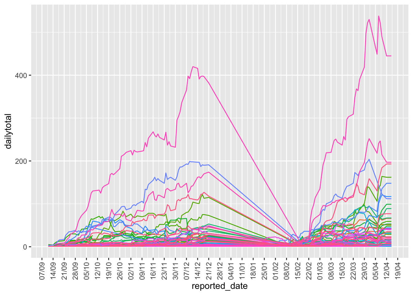
COVID-19 Packages in R
There exist a package of time-series worldwide data about reported cases for COVID-19 from the Johns Hopkins University Center for Systems Science and Engineering (JHU CSSE) data repository in R Studio.
A variety of COVID-19 packages can be found by clicking [Packages] section in the lower right corner panel of the default R studio interface and [Install] in the upper left corner of the Packages section. When you type ‘COVID-19’ in the package section, you can find several COVID-19 packages. The one used below is [covid19.analytics] from JHU CSSE.
The package of [covid19.analytics] contains many simple and useful functions that can help users easily get a powerful visual gallery. The following code shows some simple visualization and modeling functions, more functions of this package can be discovered here.
library(covid19.analytics)Pulling Data
The [covid19.data] function pulls the latest data from JHU CSSE. Data options include [aggregated] for all cases aggregated by country or a variety of time series for confirmed cases, deaths, etc… The package vignette also allows users to obtain covid19’s genomic sequence data from NCBI, but we won’t do that here.
aggretated   <- covid19.data(case = "aggregated") |> as_tibble()
confirmed_US <- covid19.data(case = "ts-confirmed-US") |> as_tibble()
deaths_US    <- covid19.data(case = "ts-deaths-US") |> as_tibble()
Auto reports
The package will perform a variety of standard reports and provide some standard models. Here is a basic summary report for North America. This function will run the report but it is a lot of info for this little html page.
report.summary(geo.loc="NorthAmerica", graphical.output = TRUE)
#report.summary(geo.loc="Canada", graphical.output = TRUE)
#report.summary(geo.loc="US", graphical.output = TRUE)